First off let me apologise for not keeping up to date with article comments - I will do so shortly. Even though restrictions etc have been rolled back in many places, I find myself more depressed than usual and try not to spend too much focus on covid. I focus on happier things - like how the fuck I’m going to survive until the end of the year if my energy bills (and other expenses like food) keep going up like this.
It seems the wizards at our official health institutions (perhaps we should call them by a new collective noun; a Rincewind1 of Experts) insist, still, that the Goo is wonderfully effective and everyone needs it.
Yes, Sir, the raw data doesn’t look great - but there’s all these confounding confounders and biases, you see. When you perform the statistical magic to remove them - and it is very dangerous, dark statistical magic that requires considerable expertise - you will see that, really, this Goo is fucking incredible. And so Safe and Effective™
Terry Pratchett wrote that a wizard’s staff has a knob on the end. What he didn’t know was the magical staffs operated by health wizards not only had a knob on the end, they were operated by knobs.
The raw data is getting so bad now that these Health Guilds are refusing to publish it. In the UK they said it’s because covid tests are no longer free and so the data will no longer be accurate. Maybe they have a point with ‘cases’ but not so much of a point when it comes to hospitalizations and deaths. Of course, we know the real reason. It’s because they don’t want the Nobby Nobbs’s and Foul Ole Rons of this world, which is apparently the rest of us, to be able to analyse it. No, that would never do. Bugrit, millennium hand an' shrimp . . .
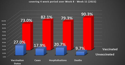
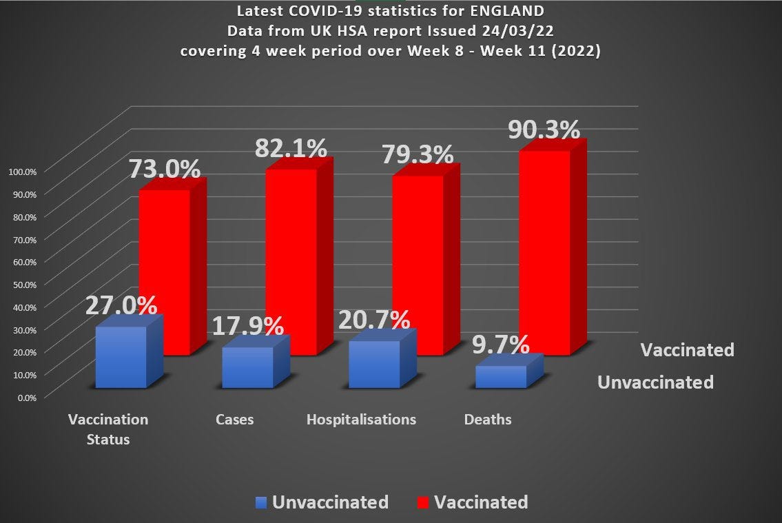
Here’s what the last set of data for England from the UKHSA looks like. And by ‘last’ here I don’t just mean ‘most recent’ I really mean it is the last we’ll see.
I haven’t checked this (image lifted from a poster on Twitter) but it looks about right judging by the previous sets of data.
I look at this, and I’m not a professional data analyst, but I’m wondering just how freakin’ big those confounders and biases have to be in order to polish a turd like this?
You can see that we have over 70% of people vaccinated, but 90% of the deaths occurring in the vaccinated. For a vaccine that has been widely touted as 95% Effective™ this would seem to be quite a remarkable achievement.
But this, according to those Rincewinds, is just an illusion brought about by the Covid Confounders of Supreme Confusion. What’s really happening is that the sheer numbers of vaccines have distorted Goo-space2 and warped things so that what appears to be an absolute unmitigated fucking disaster is really evidence of the Great Goodness of the Goo.
Other standard responses mumble something about Simpson’s paradox or the base rate fallacy.
Is it possible we’re just being repeatedly kicked in the nuts by Simpson, or have slipped on the banana skin of the base rate fallacy? Is it those blasted confounders?
I don’t think so.
The argument goes something like this. When you just take a single variable, like vaccine status, you’re ignoring all of the other stuff that might affect things - like age, or weight, or health status, or behaviour. So an overall assessment just based on the single variable of vaccine status is only going to give us a crude, and possibly inaccurate, picture of things.
Technically, that’s true. But there does come a point when one is micturating in the wind, particularly when there’s such a gross effect in the single-variable picture.
There are a variety of statistical techniques to smooth things out and eliminate biases and account for confounders (which is just a fancy name for other factors that can affect things). I’m going to take a very simple, and hopefully straightforward, approach here.
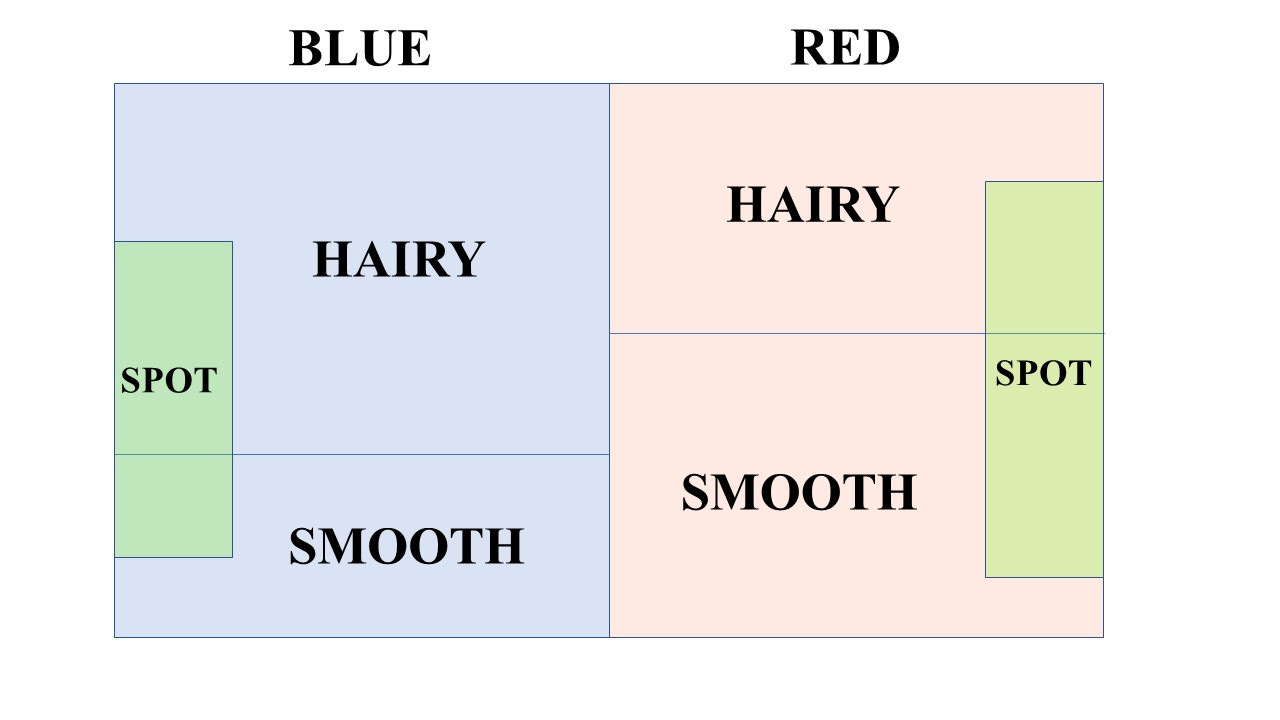
Let’s suppose we have a whole lot of balls. Some of them are hairy, some of them are smooth. Some of them are blue and some of them are red. Some of them have a spot and some don’t. We might want to let blue/red be a proxy for age status (eg 50 or above vs. 49 or below). Similarly we might want hairy/smooth to be a proxy for vaccine status and spot be a proxy for covid death. If we let area represent numbers in the various categories we might end up with a rough diagram like this.
What we’ve done here is to separate things using the confounder of colour. The overall picture would ignore the colour - so ignore one possible confounder. The overall picture, then, is just like the vaccine data in the chart above - it just splits things into vaxx/unvaxxed (hairy/smooth) whilst ignoring, for example, the potential confounder of age (blue/red). Of course, with something like age we might have to do a finer gradation still, but just a binary split will suffice for the argument I’m making.
This is a simple way we can get some insight into the effect of a possible confounder.
Now let’s think about covid death in the chart above. It is possible, given the percentage vaxxed and the percentage of deaths occurring in the vaxxed, to work out the vaccine efficacy for this population. I won’t go through the details, but suffice it to say that the figures in the chart of 70% vaxxed and 90% of covid deaths occurring in the vaxxed mean that the overall vaccine efficacy is negative.
What about the confounders though?
Well, so far I have only been able to generate a partial proof3 but it is not possible, given the fraction of vaxxed vs unvaxxed, for there to be a way to split the data (split into confounders like blue/red) such that the subgroups each have positive efficacy whilst the overall efficacy is negative. At least one of the subgroups must have negative efficacy (and that’s going to have to be much more negative than the overall efficacy if the other subgroup has a positive efficacy).
The conclusion is that you might be able to split the data with some confounder like this such that you find a subgroup with positive vaccine efficacy, but the other subgroup is going to have a negative efficacy (and more negative than the overall efficacy).
The other thing I’m working on is answering the question just what the data would have to look like if the overall vaccine efficacy was, as has been claimed, something like 95% ? I’ll leave that for another time.
Meanwhile it’s time for the Rincewind of Experts at these Heath Guilds to remember to take their dried frog pills.
If you haven’t read any of the Discworld novels by Terry Pratchett some of my comments might seem a little odd. Rincewind was a particularly inept and unpleasant wizard in his books
In the Discworld series there is something called L-space. It’s what happens in a library where the sheer weight of the words distorts the space around it. L-space is a very dangerous place and can only be navigated by competent Orang-Utans.
In essence if you split into subgroups and the overall vaxxed percentage is 70% then if the subgroups have over 30% vaxxed percentage it is not possible to have overall negative efficacy with positive efficacy in the subgroups - at least one of them must have a negative efficacy. I’m fairly confident the result is true in general, but have only been able to prove it fully (so far) in this more limited case where if the overall vaxxed percentage is X and the subgroups have a vaxxed percentage greater than 100 - X, the result holds.


Apologies - the original version of this (which you will have received by email) had a couple of slips. I got carried away with the spot/no spot diagram and the original didn't make sense. The article has now been updated so if you click the link to see it on the website (rather than going off the email version) you should see the updated version.
Good essay. Hang in there, Rudolph Rigger. The lies and gaslighting are meant to demoralize; part of the plan. You are sane and able to spot the lies.