I jumped the gun and ran straight into a speeding Simpson
I’m embarrassed. I should have known better. I got a bit carried away and, in my enthusiasm, made a very stupid and elementary mistake.
In my (rather weak) defence I had just spent a fair amount of time looking at the data from the UK’s Office of National Statistics (ONS) on weekly death registrations which indicated a worrying rise in percentage excess mortality. I believe that some of this is probably due to the effects of vaccination (it can’t be proven from the data - but there’s certainly something there that needs further investigation).
So, naturally, when a chart came out purporting to show a rather strong effect of vaccination I got all confirmation-biasey on myself and jumped on it. I forgot to think.
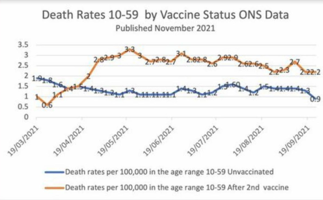
Here’s the offending chart - also from the ONS, but not the same data set as the weekly registration data (the ONS publish a lot of stats and it’s not always easy to find what you need)
Now it’s technically true that there is a higher rate of death in the vaccinated 10-59 cohort. What wasn’t true was the implication I drew from it.
The problem here is rather obvious - and I really should have engaged my brain before typing madly on my keyboard. The problem is that this age range is very broad and the unvaccinated cohort skews heavily towards the younger age demographic which have a lower death rate. So what I think we’re seeing in this chart is an artefact of this. There may still be some vaccination effect making things worse, but we can be absolutely certain it’s not as significant as the naïve inference from this chart would suggest.
This is an example of something known as Simpson’s Paradox. It’s another one of those seemingly counter-intuitive and curious things that occur in probability and statistics. It only seems to be a paradox if you ignore, as I did, the effects of weighting.
There’s a great example I use to illustrate this from the world of gender pay gaps - although I have to hark back to more traditional times because these days I haven’t the faintest idea what a man or a woman is supposed to be.
Let’s imagine a hypothetical company; Patriarchy Inc., or PI for short. This company employs both men (50% of total workforce) and women (50% of total workforce) in either managerial roles, or office roles. Despite its name, PI pays women $55k for management roles and $25k for office roles. For men it only pays $50k for management roles and $20k for office roles So, for each role, women are paid more than men.
Great - the DIE (Diversity, Inclusion & Equity) people should be happy.
But along comes Jemima Greenhairdo (pronouns ding/dong) who notices that only 25% of the women are employed in a management role, whereas it’s 75% for men. If you now work out the average pay for women, and the average pay for men, across all roles you get the following
Average pay for men : $42.5k
Average pay for women : $32.5k
So for the company as a whole, women, on average, are paid less than men - despite being paid more for each individual role.
It’s a nice illustration of how careful we have to be with statistics. There are lots of other traps to get caught up in too.
I should have known better, but to add another equally weak defence on my behalf I am much happier with squiggles and formulae than I am with data - I’m still learning on the data analysis side of things. I agree - not much of a defence against my wanton stupidity here.


