Writing on the back of the counterfactual envelope
There’s this ‘thing’ in technical disciplines known as a back of the envelope calculation (BoE). It’s a rough and ready kind of reality check that gets done when someone proposes some new idea or claims a new result. They’re not infallible by any means, but they are very useful when scoping out a problem.
They give us a handle on questions like is the hammer of destiny hitting in the approximate area of the nail, or has it smashed in the back door of delusion?
They are a kind of ‘sniff test’. Does the hair on this idea smell like it’s something worth fondling further?
In the la la land of covid, counterPfactuals are king. They are guesses1 as to what would have happened. If we hadn’t locked down, 34 billion people would have died of covid - that sort of thing.
Counterfactual reasoning is actually important, even though it seems I’m being dismissive. One of the ways we test counterfactual reasoning is to scribble on the back of our envelopes and perform a sniff test, whilst happily mixing our metaphors.
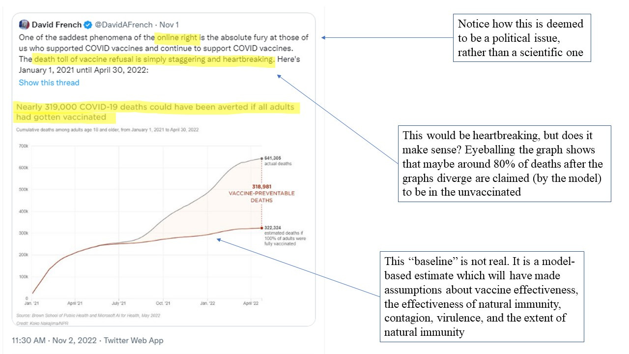
In the continued craze to promote the Holiest of All Vaccines, the Most High Sacred Shot of Deliverance, a lot of counterPfactual reasoning is employed. Here’s one that was doing the rounds on Twitter
It’s being used, by some, as a kind of “proof” that the vaccine has been tickety-boo and that, tragically, people have died because of their anti-vax stupidity. If only those dumb anti-vaxxers would just stop with all their misinformation, right? They’re, literally, killing people with their promotion of misinformation. Censor me harder Daddy.
When I saw this graph my first thought was “that’s pretty good evidence the vaccines have failed”.
Look at the overall picture we’re being asked to believe. It’s evidently a ‘successful’ vaccine, right, because just look at the difference between those two graphs! Look at how many people have died because they weren’t vaccinated!
But, simultaneously, we’re supposed to imagine that after a year of covid in which everyone (essentially) was unvaccinated, things are now WORSE for (the now smaller fraction of) unvaccinated people?
Did all those unvaccinated people somehow escape being infected in the first year? Or is the very high percentage of people who have been exposed to SARS-CoV-2 still as at much risk as they were before?
It only really makes ‘sense’ if we imagine (a) exposure-acquired immunity is ineffective and/or (b) covid somehow magically became much worse for the unvaccinated.
Of course, the upper graph (based on official data which doesn’t distinguish between with/from and has been subject to certain pressures to inflate the numbers) is ‘real’. The lower graph is pure speculation - and it’s a load of bollocks.
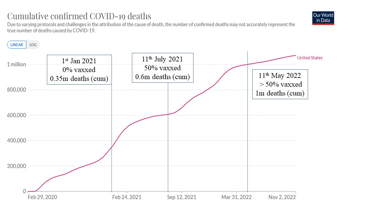
I don’t know which country the original graph is supposed to be examining, but let’s head on over to Our World in Data (OWD) and take a quick peek at their charts for the US.
Here, ‘vaxxed’ refers to those who completed the initial double-dose protocol and the cumulative death totals have been rounded. The number of vaxxed for the start of 2021 is given as 0.02% by OWD - but we’re fixated on the back of that envelope so we’re not going to worry too much about absolute precision.
We’re going to look at two 10-month periods. The initial 10 months of the pandemic up to the start of vaccination, and the 10-month period following the benchmark of 50% vaccination.
Period 1 (Feb-Dec 2020) : 0% vaccinated, 0.35 million covid deaths
Period 2 (11th July 2021 - 11th May 2022) : > 50% vaccinated, 0.4m covid deaths
In the best-case scenario (for the vaccines) we would have ALL of the covid deaths occurring in the unvaccinated - and this will give us a kind of upper bound.
So, what’s the death-rate in the unvaccinated in the two periods? We’re still in BoE mode so we’re going to assume the population hasn’t changed. In the initial period (period 1) we have a death rate of R1 = (covid death in P1)/N where N is the population and they’re all unvaccinated.
In period 2 we have N/2 people unvaccinated (as a lower bound) and so we have an unvaccinated death rate of R2 = 2 (covid death in P2)/N
Comparing the two - and putting in the numbers from OWD we find that :
The death rate in the unvaccinated in period 2 is 2.3 times higher than the death rate in the unvaccinated in period 1.
OK - before we run away with ourselves here, we should remember I’ve assumed 100% efficacy for the vaccine. I’ve also not taken into account anything like the dynamics of infection, for example, which might be different for the 2 periods, etc, etc, etc.
However, this simple BoE calculation should be raising a few red flags, or eyebrows at the very least.
Are we using a hammer when we should have been screwing things?
Let’s make an assumption. The death rates in the unvaccinated in periods 1 and 2 should be the same. We can take issue with this assumption in various ways - not least because the disease dynamics were different, but also because we ended up with milder variants (which might be offset by greater contagion). But let’s run with it in our cavalier BoE mode.
Let’s also introduce the radical idea that the vaccine is not 100% effective.
So, we can now ask the question, if our assumption is correct and the unvaccinated death rates for the 2 periods ought to be broadly equivalent, what is the vaccine effectiveness?
The deaths in period 2 are made of unvaccinated deaths RN/2 plus vaccinated deaths fRN/2, where R is the unvaccinated death rate and vaxxed death rate = fR.
Doing a wee bit of algebra, we end up with an expression for f which is a measure of vaccine efficacy (it should be less than 1 for an effective vaccine).
f = (2D2/D1) - 1
where D1 and D2 are the deaths in period 1 and 2, respectively.
Plugging in the OWD numbers, we end up with f = 1.3
So, if we think unvaccinated deaths should be roughly comparable in rate in the 2 periods, we’re left with the vaccine having made things worse.
It’s BoE mode so we’ve left out a few things. Are the patterns of disease and prevalence broadly comparable in the two periods? Can we really assume a similar unvaccinated death rate? How big would the difference have to be with a 70% effective vaccine, for example? On the other hand, we haven’t accounted at all for disease/exposure acquired immunity. This latter consideration, where we know maybe 75% (or more) of the population has been exposed to covid, really, really, really, messes things up for the vaccine.
The long and short of it is that a simple BoE calculation shows us that we’re going to have to do an awful lot of jiggery pokery in order to make the cumulative death data consistent with the notion of a highly effective vaccine.
Vaccine nirvana or vaccine nervosa?
I’ll let you Pfigure that one out for yourselves.
I’m being a bit pejorative here - in technical disciplines counterfactual reasoning is based (usually) on considerably more than ‘guesswork’.


I saw this:
"They are a kind of ‘sniff test’. Does the hair on this idea smell like it’s something worth fondling further?"
Then initially thought that the rest of the article would be about the prez.
David French is a hack. May God have mercy on his soul