
Vaccination and the Death Ratio (part I)
Vaccination and the Death Ratio (part I)

You may recall some time ago that the UK HSA (UK Health Security Agency) used to put out some stats regarding the vaccine. They stopped doing this when people started to point out that maybe, just maybe, the stats weren’t working in the best interests of the vaccine propaganda misuse the data.
People used the data to create charts like these
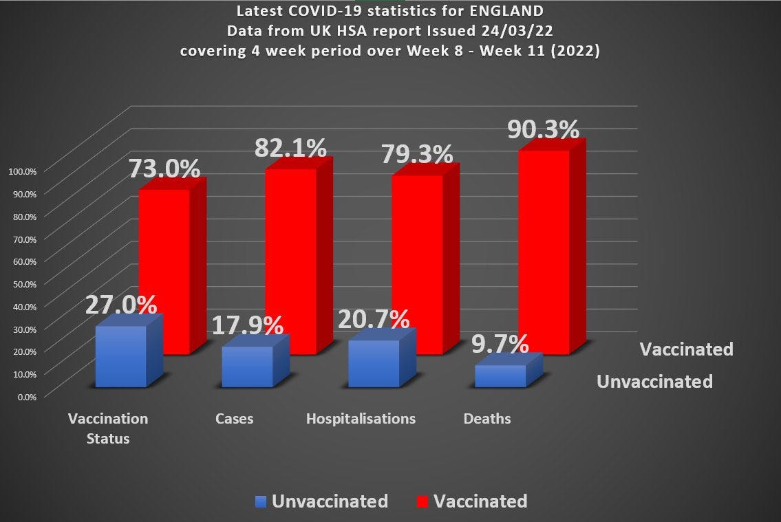
How could it be that a highly effective vaccine, that nearly 3/4 of the country had taken, resulted in 90% of those dying from covid being in the vaccinated category?
TeamPfizer™ stepped up to the plate and objected. This chart, they claimed, was misleading because:
It’s whole population data and we know that older people are more at risk and so the data needs to be broken down into age cohorts (or otherwise age-standardized)
If lots of people have taken the vaccine, then we’d expect more people to be dying in this vaccinated category
Base rate fallacy and/or Simpson’s paradox
But were they right?
There’s definitely some legitimacy to the claims here - but can they be used to entirely exonerate the vaccines?
It’s certainly true that if you vaccinate everyone with a vaccine that is not 100% protective against death, then 100% of the deaths will be in the vaccinated category. But does this increase in deaths with increase in vaccinated percentage explain the stats we observed?
I’m going to ignore the effect of age, for now, and assume we’re talking about a particular (and relatively narrow) age cohort. So I’m really addressing claim number 2 here.
What are the limits here and how can this data be consistent with the claim of a highly effective vaccine?
The Death Ratio
Emphasizing again that I’m initially limiting the discussion to a narrow age cohort, let’s consider the ratio of vaccinated to unvaccinated deaths in this cohort.
We’re going to assume that the fraction of people who have been vaccinated is g. This is a number that varies between 0 and 1. If g = 0.23, for example, then 23% of this cohort will have been vaccinated.
In the absence of vaccination we’ll assume the death rate is f which we’re going to write as a fraction that varies between 0 and 1, too.
We’re going to assume some vaccine effectiveness and label that with the Greek letter epsilon.
And finally we have the population stats themselves for total number in the cohort (N) and the number of vaccinated and unvaccinated deaths.
The number of people dying in the unvaxxed category is therefore
The number of people dying in the vaxxed category is therefore
The death ratio, D, is then just the ratio of vaxxed to unvaxxed deaths and is given by
The f and N cancel out and you’ll be pleased to know1 that if we solve this equation for epsilon we recover the standard expression for vaccine efficacy.
So we can answer questions of the kind:
If my vaccine has 90% efficacy and I vaccinate 73% of my cohort then what death ratio do I expect to see?
Here’s the graph of D plotted as a function of vaxxed proportion with the assumption of 90% vaccine efficacy

In the initial chart we have a death ratio of about 9 with 73% vaccinated. So something is not adding up here. If we observed this data (a death ratio of 9) in any specific narrow age cohort we’d have to have vaccinated nearly 99% of this cohort with our 90% effective vaccine.
The dashed line is the ‘break even’ point where D = 1.
Well, perhaps the vax is not as effective as we have assumed. Let’s suppose it’s not all that great and we have only 25% vax efficacy.
Here’s the chart for our less effective vaccine

With our new and not-at-all improved vaccine jabbed into 73% of the population of this cohort we would expect to see a higher death ratio (about 2), but we’re still needing to have vaccinated over 90% in order to get to our observed ratio of about 9.
So, yes, the death ratio does increase as we increase the proportion vaccinated, but this cannot, alone, account for the huge discrepancy between expected and observed data.
What Does This Imply for Efficacy?
Again emphasizing that I’m only considering a narrow age cohort here, let’s see what these kind of figures would imply for efficacy.
You can either use the standard expression for efficacy, or approach it as I have (equivalently) done above, but we have the formal relationship
I have written D as D(g) to remind ourselves that D depends on g (the higher percentage vaxxed, the bigger the death ratio).
Now, I’m going to treat D as an experimentally derived number. In other words, we get our value for D from our observations.
The observation of D ought to be reasonably accurate. It is a death count associated with whether or not a particular person has been vaccinated. Assuming no underhand practices went on (like conveniently ‘forgetting’ that someone had been vaccinated, or treating those who die within 2-3 weeks of vaccination as “unvaccinated”) we can expect this to be not too far off.
The value for g, however, is based on population wide estimates - and we don’t properly know exactly how many people are in the UK. The various agencies in the UK have used values for g that differ quite significantly from one another. There is, thus, considerable uncertainty about what g is.
So, given our experimentally observed value of D = 9, what can we say about efficacy?
What I’ve plotted in the chart below is the efficacy according to measured quantities. We measure our D (assumed accurate) and measure our g (not very accurate) and determine the efficacy based on those figures.
I’ve allowed for variation in g. The blue curve is based on the given observation. The green curve is what this should be if we had underestimated the vax fraction by 10%. The red curve is what this should be if we had overestimated the vax fraction by 10%.
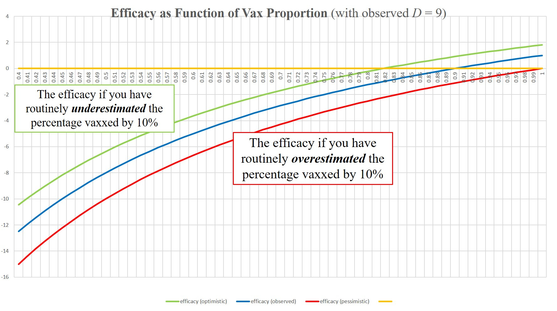
None of these curves gives a positive value for efficacy until we’re above about 80% proportion vaxxed.
As we know, however, the percentage vaxxed has been routinely overestimated and so the red curve is closer to reality.
The claim of “highly effective” looks extremely dubious based on these observations and even the claim “any efficacy at all” doesn’t look all that good, either.
BUT . . .
Remember this is for an assumed narrow age cohort.
Does factoring in an age dependency give a “way out” for the vaccines?
I’ll attempt to address this in part II
Conclusion
I’ve taken the death ratio as an observation here and tried to do a simple analysis of what it means. The big limitation is that the results here can only be applied within a specific narrow age cohort (and assuming no other bias between vaxxed and unvaxxed - although a healthy vaccinee bias would tend to work in favour of the vaccines for a death ratio).
What it means is that we can test the vaccine claims if we had the data for specific age cohorts that are sufficiently narrow.
The claim that “all we’re seeing is a result of more people being vaccinated” is not sufficient, on its own, to explain the serious mismatch between expectation and observation with this UK HSA data. In order to “save” the vaccine narrative we also have to look at age dependency.
I’ll try to develop a simple model for part II to see if there is, indeed, a way for the vaccines to save face here. The brain is kind of slow these days, so it might take a while.
Absolutely chuffed to bits and over the moon
Thanks for this. If your brain is slow mine is in reverse. At the very least if a frail old person is vaccinated against Covid and the vaccine is effective, shouldn’t they be dying of some other cold? It’s hardly an argument to me that the vaccine just doesn’t work very effectively in the one segment of the population that actually really needs it.
Great work! I will share...