

Time for a 2nd Round
A further look at the overall picture from the data


I’ve got through my 2nd round of looking at the death registration data from the Office of National Statistics (ONS) for 2020 through to Oct 29th 2021, for England & Wales. I’m going to use, but not focus on, the covid death data - it’s too unreliable. Anyone dying of an arrow through the head within 28 days of a positive covid test would have been included in the stats (a slight exaggeration, but not too far off the truth).
You can fudge and mislabel covid deaths, as they have done aplenty, but you can’t really fudge death itself. So I’m going to have a look at the all-cause mortality data and see if there are any lessons to be learned, or interesting trends to be found.
So how do things stand coming into Winter 2021 in England & Wales?

This is the overall picture. The 2 seasonal spikes in death can clearly be seen, as can an increasing excess mortality coming into Winter 2021. The blue bars represent the contribution of covid to the death toll - although, once again, please bear in mind these figures are not accurate and very much represent quite a gross overestimate of the number of actual covid deaths.
One thing to note is that sharp dips in either the average or current figures are due to reporting delays (holiday periods etc) - and there’s an issue of matching up the weeks between the historical and current data I haven’t sorted yet (looks like there is a week offset). It’s annoying, but not serious for our purposes today - and doesn’t significantly affect any conclusions we can draw from the trends.
Let’s plot the same data in a different way using a kind of “radar” plot, which stretches the data round a circle. It’s quite illuminating
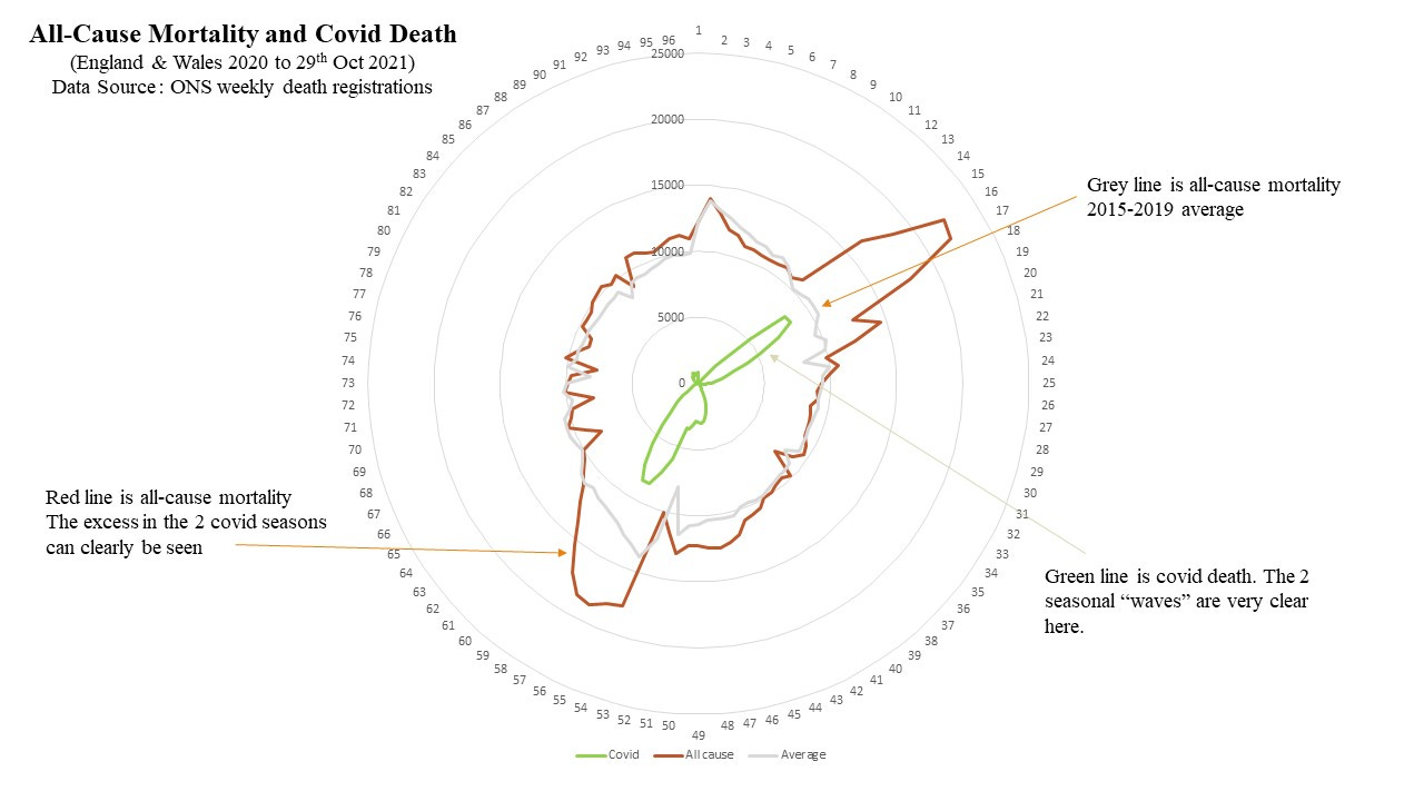
Again we can see the 2 seasons quite clearly, but notice the current, much lower, impact of covid on the death figures (this can also been seen in the first plot).
These kind of charts can be useful to get a broad feel for what’s going on but really we need to understand the scale here. The raw numbers only tell us so much and sound quite large. What we really need is to understand how much of a deviation from “normal” is this?
We can get a 1st order estimate of this by using the average (arithmetic mean) of the previous non-pandemic years 2015 - 2019 as a baseline. Just doing a simple subtraction “Current All Cause Mortality minus Historical Average” gives us a number for this deviation from normal - it’s known as excess death.
This is still not quite enough. How much deviation from normal? For this we really need to be looking at percentages. We need the excess death expressed as a percentage of the expected death (the historical average) and that will tell us whether the excess is 10% worse, or 90% worse, for example.
You can find the charts for 2021 up to 29th Oct here.
The ONS historical data is broken down into fairly large age chunks - so I’ve stuck with these. Here I want to focus on the over 45’s and look at the percentage excess over the pandemic period. It looks like this

There are a few interesting things about this chart. Notice the very sharp rise in percentage excess during Spring 2020 - and the much less steep rise coming into Winter 2020. Also note the 2nd peak is only about half the size. This is entirely expected. By Winter 2020 there was a significantly higher degree of community immunity which meant the virus, try as it might, simply couldn’t get the same foothold as it did in Spring 2020. The typical seasonality of a coronavirus meant it hung around longer in Winter than Spring.
Now what I find very interesting is that coming into Winter 2021 - we appear to be in a worse position than at the same time last year. Despite very high levels of vaccination we’re not better off in terms of all-cause mortality. Whether what we’re seeing here is a direct result of vaccination, or the effect of our deranged covid policies, cannot be determined from this data. It is likely to be a mix of both.
It will be interesting to see how this progresses over the next few weeks.
What about our vaccination program? Has that helped? Let’s look at registered covid death. The real reason for this chart isn’t really to focus on the deaths themselves but to split the time period up into high and low impact regions. A secondary reason is to, once again, highlight the extremely age-stratified nature of covid mortality. Although this has been said time, and time, and time, and time, again - it doesn’t seem to reach some of the younger demographics who appear to still act as if getting covid is some sort of immediate death sentence.
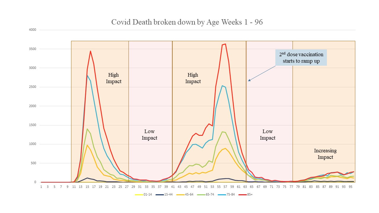
The 2nd dose of the vaccine begins to ramp up around week 10 of 2021, which is week 63 of this chart.
But Hey! - doesn’t this prove the vaccines have done their job? Not quite - we vaccinated (1st dose) into a time of rapidly decreasing mortality. The curves were decreasing even in the unvaccinated cohort - which indicates the primary driver of the mortality curve was not vaccination (virus gonna virus).
This chart might indicate some signal of vaccine effectiveness against covid fatality as we come into Winter 2021 - especially if we couple it with the “case” data (although this is horribly unreliable too). This would not be inconsistent with the UKHSA data which does appear to show some effectiveness of the vaccines in protection against covid mortality (although the data really is such a mess it’s hard to definitively say one way or another).
However, and this again indicates a problem with our ultra-narrow focus on covid, it’s no good a surgeon fixing your knee if the surgery results in requiring the whole leg to be amputated. What’s important is to look at the overall picture, and not just the narrow slice of medical reality that is covid.
One thing to also note on this covid death chart is that the increasing trend as we come into Winter 2021 is affecting the higher age groups - not the under 45’s.
If we take a look now at the high and low impact regions and focus on the percentage excess mortality in these regions, we see a picture that isn’t really a great advert for the success of the vaccination program.
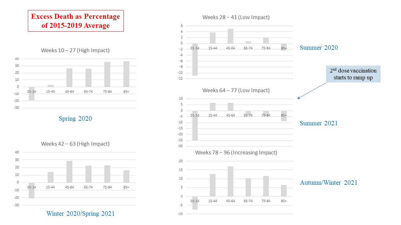
There’s lots to unpick in these charts - and I’m sure I’ve not spotted everything of interest. One interesting thing is that consistently for the duration of this pandemic deaths in the 01 - 14 age group have been below expected.
A very interesting thing to note is the effect of disease prevalence - the difference between the high and low impact charts is striking.
We might look at these charts and see the decline in percentage in the over 75’s and attribute this to the vaccines - but we don’t see a similar reduction in percentage mortality in the 45 - 64 age group - and we can see from the age-stratified covid death chart these figures cannot be fully explained by covid death in this age group.
What is clear is that any benefits we might suppose to have accrued from the vaccines in weeks 63 onwards have been entirely reversed by the time we hit week 77. [We see the same kind of reversal happening in the 85+ group as we transition from low impact (week 28 - 41) to high impact (week 42 - 63)]
Another interesting group is the 15 - 44 age range. They seemed to have been minimally affected in terms of all-cause excess percentage in the first season, more heavily affected in the 2nd season, but are currently experiencing an excess at the same levels as this 2nd season - and this cannot be attributed to covid (look at the covid impact region chart above).
Whatever it is we’re doing - it’s pretty clear we’re not making things better overall. It’s possible the vaccines might be helping us to reduce covid death, but it doesn’t look like our overall health is improving at all, and is getting worse. Given the very high level of reported side effects of these vaccines I don’t think this worsening is simply because of delayed treatments, although that will be a factor too.
The final chart gives the covid death counts.
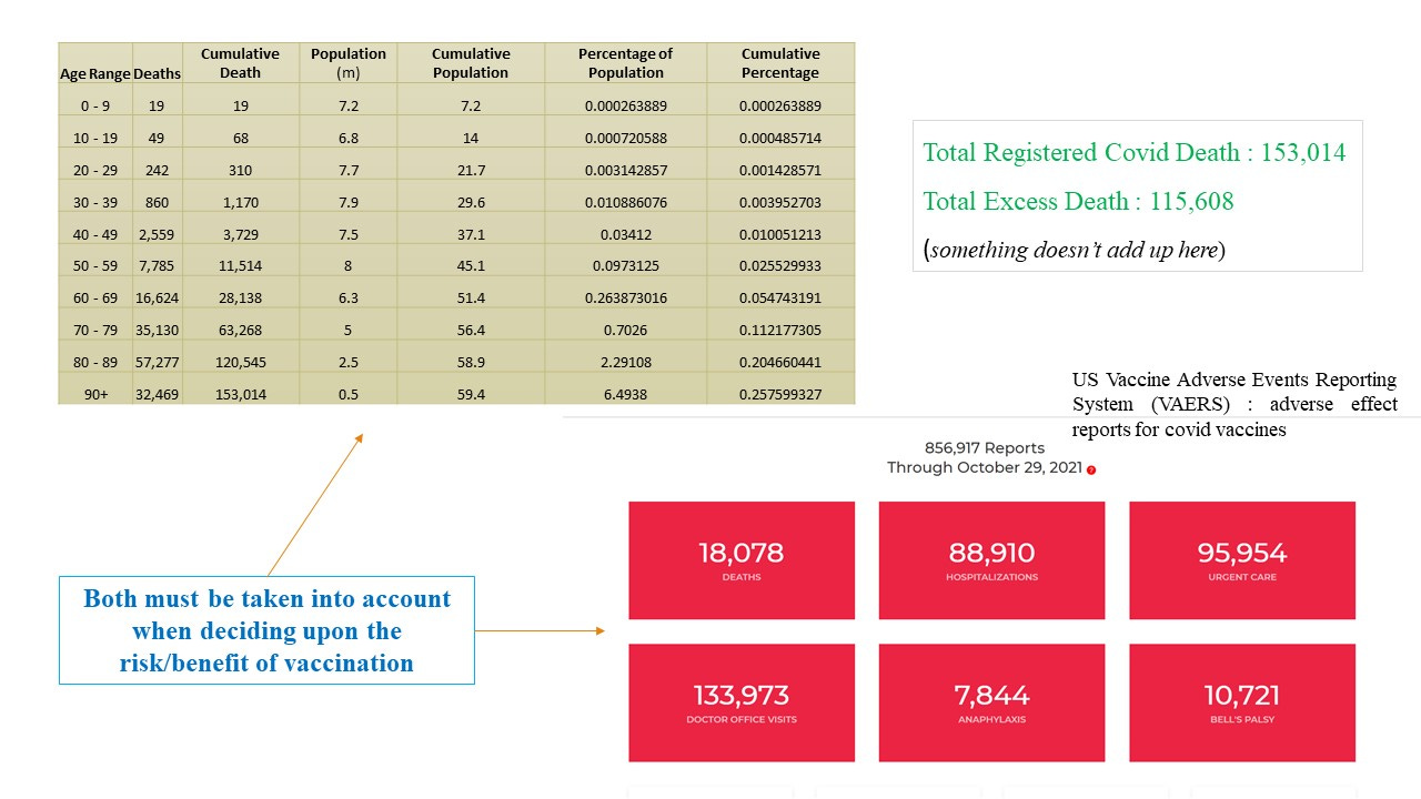
The total covid deaths registered are about 40,000 higher than the excess deaths. It’s almost certainly because of the terrible methodology for assigning cause of death during the pandemic - which has led to a gross overestimate of covid death.
The figures also underline the complete absence of any justification for the vaccination of the under 20’s (and probably some higher age groups too). Only 68 deaths, attributed to covid, have occurred in this age group - out of a group population of 14 million. I keep saying it like a mantra : sixty-eight out of fourteen million - hoping that by continued repetition I can make some sense of the maniacal push to vaccinate kids.
I can’t.
*I’m well aware of some of the inadequacies in using the fairly simplistic statistical approach I have adopted. I don’t, however, think these observed trends are going to disappear if we use more sophisticated statistical techniques. I’m not seeing the clear signals of vaccine safety or efficacy that I would expect to see, given the claims made. We’re talking very high alleged levels of efficacy and safety - and we should be better off than we are if these claims were true.
I've always thought that last autumn/winter (20-21) the country was going into a fairly normal, somewhat above average seasonal rise (weeks 41-52 on your charts) and then there was a really sharp peak in Jan which as I recall coincided with the roll out of the vaccine in the oldest age group. It's hard to tell exactly what the trend is at wk 52-3 because of the Christmas/New Yr blip, but the impression I took away was that it was levelling off ore even starting to dip - so I've always been of the opinion that the 'vaccine' just made things worse last winter. In view of the below average deaths in the older age groups later in the year it looks as though maybe their lives were cut short by about 6months or so (maybe no great loss to them considering the conditions everyone was being forced to exist under at that time).