

The plot, like our blood, thickens

Today I wanted to depart a little bit from my usual polemic style and have a look at some data. All my previous analyses went up to April 2021 and I’ve been meaning, for ages, to download the more up to date dataset.
I downloaded the numbers for 2021, up to 29th October (week 43) as published by the UK ONS (Office of National Statistics) which can be found here. This data is for England & Wales, and is a list of registered deaths. There are some limitations with the data. It is not adjusted or standardised in any way by population or age or anything else. It is, I believe, based on date of death registration rather than date of death.
Those caveats aside, it is, however, more than good enough for us to be able to spot important trends in the data. The results and comments are a little bit provisional, but interesting enough that I thought it worthwhile to draw attention to them.
One further limitation of the historical data is that I can only find the data for the 2015-2019 years (the data used to generate the comparison with “normal”) broken up into relatively crude age chunks; <1, 1-14, 15-44, 45-64, 75-84, 85+. So I’ve stuck with these non-ideal breakdowns.
I’m not going to use any fancy statistical techniques here. Just a fairly straightforward here’s what the data looks like approach. I’ve always been, rightly or wrongly, mostly of the mindset that if some effect is important it should be bloody obvious.
I’m going to look at all-cause mortality. One of the huge problems with the covid death data is the obvious inadequacy. Deaths, for any reason, within 28 days of a positive covid test were listed as a “covid” death. Notwithstanding the serious problems with using a positive PCR test to define a “case”, this is a really dumb thing to do. In the middle of a (supposedly) novel and unprecedented pandemic, this is the way you collect data? Wouldn’t you want the most accurate and correct data possible? Apparently not.
You can’t really mess about with a death for any reason - it either happened or it didn’t. I suppose you could actually falsify the data, but I very, very, very much doubt whether this has been the case for the ONS.
The first graph to look at, and this gives us a bit of context, is to see what all-cause mortality looks like in a “normal” period. 2020 wasn’t a normal year at all, so if we’re going to compare 2021 to a “normal” period, to see how far things deviate from what we expect, we need to do the comparison for the years 2015-2019 which will give us a more realistic 5-year average to compare.
Here’s the graph for average all-cause mortality, by week, for the 2015-2019 period. It’s not population-adjusted and only uses a basic arithmetic mean for the average - but it gives us a place to start.
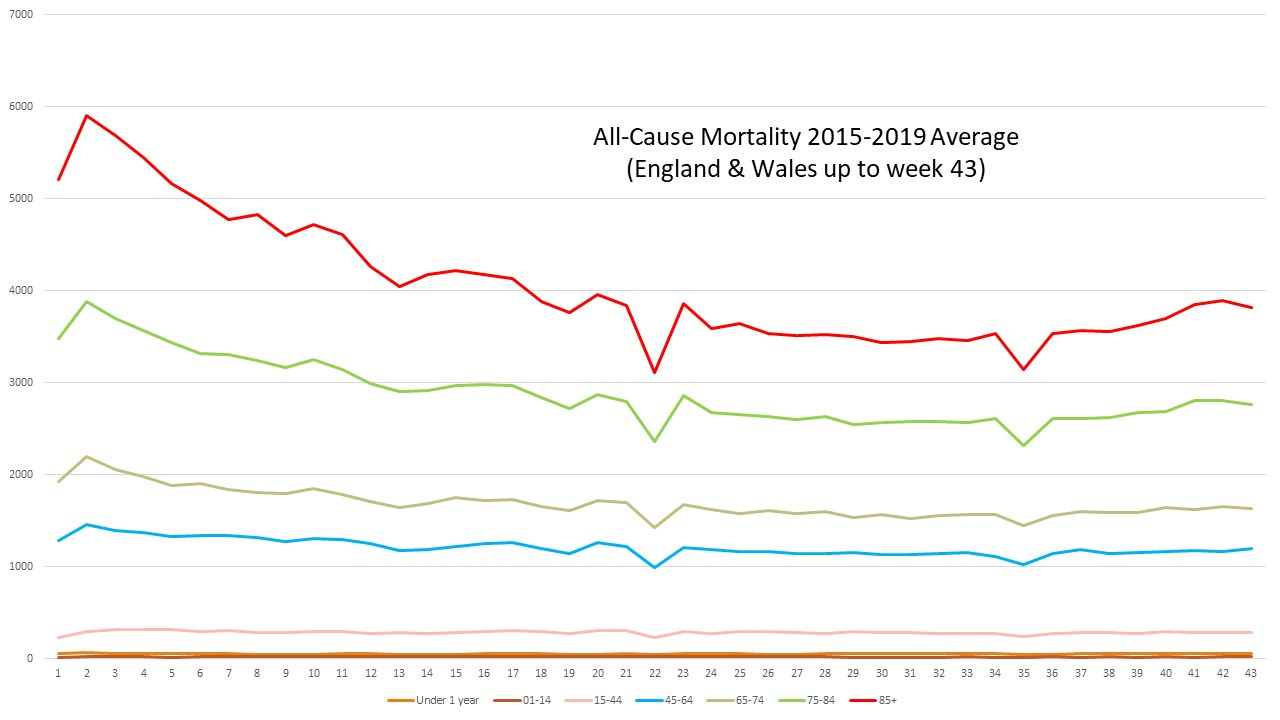
A couple of things to notice about this chart. You can see the “Winter hump” for the over 65’s. Typically, elderly people are more vulnerable during the Winter months. Secondly, doing a very rough and ready eyeballing of the chart you can see that deaths in the over 75’s are going to be about 7,000 per week, on average. This is a normal, non-covid, period - so it allows us to put any covid death stats, as inflated as they are, into the proper context.
The sharp dips in the curve here are artefacts of holiday periods where things are a bit slow - one of the issues with relying on date of registration rather than date of death.
This chart, and the underlying figures, give us a sort of baseline. This is (approximately) what we would normally expect in a typical year. What we’re interested in, of course, is whether the pandemic year 2021 is different. Do deaths this year deviate significantly from what we might expect?
A crude, but useful, way to do this is to look at excess death. This is the difference between what we actually see and what we expect to see. If it’s positive - we’ve seen more deaths than we expect. If it’s negative - we’ve seen fewer deaths than we expect. It’s also useful to express this as a percentage. So it answers the question what is the percentage difference?
The first thing, then, to look at is the overall excess death expressed as a percentage of what we would normally expect. Here’s what it looks like.
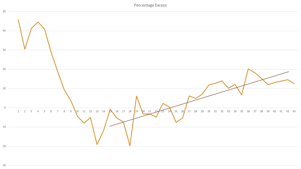
I’ve drawn in a crude line to illustrate the trend (note : this is not a calculated line - just eyeballed). Because of the fluctuations it’s hard to see where this trend begins, but it looks to be getting started somewhere around week 14.
It looks very much like from around the end of March something was beginning to drive excess death up. That’s a bit worrying.
This chart is for all ages, so the next question to ask is whether this is occurring across all age-ranges, or is it being driven by specific age groups?
Here’s what it looks like broken down into ages (note: this is not in percentage terms here - just the raw numbers)
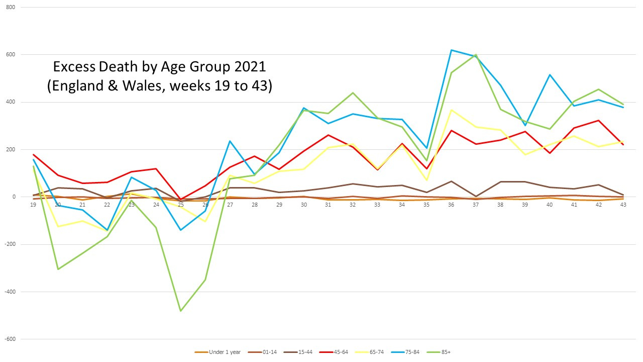
We can see here, based just on the numbers, that the increasing trend appears to be primarily amongst the over 45’s. So let’s split in data into 3 groups; 0 - 14, 15 - 44 and 45+. Here’s what this split looks like
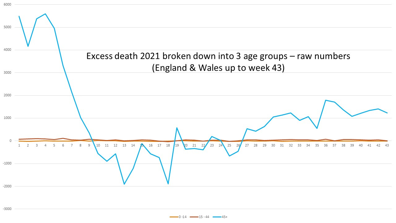
Once again, these are just the raw numbers. If we stopped there, we’d think this was just happening for the over 45’s, but if we look at this data expressed as a percentage we see the true trend.
Here’s what the percentages look like. It’s a chart of the percentage excess, relative to the 2015-2019 norm for these 3 age groups
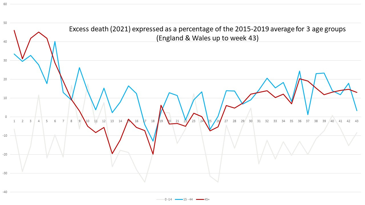
This is a very interesting chart. What we can see is that, in percentage terms, we’re seeing an increasing trend of excess mortality in the over 15’s. The under 15 group is showing a reduced level of excess death, overall (this data fluctuates more because deaths in this age group are relatively rare so small changes in numbers can have a big effect on percentages).
We’re seeing a very worrying trend of increasing mortality in the over 15’s, but not for the under 15’s. This trend is only brought out when we look at the percentage increase/decrease - and the trend is clear, and consistent for the age groups 15-44, and 45+.
What’s happening here? I don’t know. Could it be we’re seeing the effect of delayed hospital treatments and diagnoses because of our ridiculously out-of-proportion response to covid? Maybe. Might it be the effect of vaccination? Maybe. Might it be some combination of these?
I simply don’t know. We need to find out - and quick. This is a very worrying trend in the data. What it does seem to indicate is that, whatever we’ve done we have made things worse compared to a normal year. The purists will say “oh, it would have been soooooo much worse if we had done nothing, like we do for flu”. Me? I’m not so sure of that at all. I think we’d have been better off by just doing what we do for a flu outbreak.
As a final word I should just caution that I haven’t double and triple-checked these graphs yet so they’re only preliminary. I’ve only used crude first-order stats and really we should be doing a more complete job by looking more closely at confidence intervals and standard deviations and the like. I believe, however, that the trends are clear and real - and very worrying indeed.