

Taking a sniff at wax beans

I was bored and so got into a Twitter discussion about vaccines. There were only a handful of people in the world remotely interested and, of course, I was trying to be restrained in what I said (free speech and all - thanks Twitter). The poster I was responding to had, uncritically, taken the absurd number of 20 million deaths worldwide saved in 2021 by the vaccines as fact. The number originates from a (yet another) modelling paper, in The Lancet, from the Imperial College Dept of Random Number Generation.
The paper doesn’t pass the “sniff test”, even without trying to understand its details. After a year of covid in 2020 a large degree of community immunity had built up and, according to official stats about 2 million people had died of covid. To suggest the counterfactual that this would have increased by an order of magnitude in 2021 without the vaccines is patent nonsense and flies in the face of everything we know about respiratory viruses and immunology. Sars-Cov-2 might, debatably, be described as ‘novel’, but it doesn’t perform ruddy miracles.
There’s nothing wrong with counterfactual reasoning. It’s a valuable tool. It’s a kind of “what if” question, a thought experiment, if you like. The big “counterfactual” with covid, of course, is to try to figure out how things would have looked if the wax beans had been as safe and effective as claimed.
The recent substack post by EGM assessing some other vaccines was fascinating and, whatever position one holds on vaccines overall, presented compelling evidence that some vaccines, at least, have worked rather well. It was compelling for me, at any rate.

The chart in the article that, for me, presents very compelling evidence for the efficacy of the measles vaccine, at least, is the following
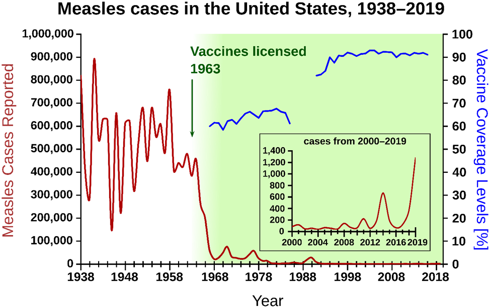
You can see that by around 1968 vaccine coverage was around 60% and cases had jumped off a cliff. It’s a virus that has an R0 estimated at 18 - and so at least 5 or 6 times more infectious than Sars-Cov-2.
I don’t want to get into the ins and outs here, or discussions of adverse effects, but the efficacy of this medical intervention in terms of cases is stark and immediately apparent. This is what a vaccine that “does what it says on the tin” looks like.
As I discussed in a previous post, the standard definition of vaccine efficacy against death can be rewritten as e = 1 - ab where a is a factor representing the change in fatality rate and b is a factor representing the change in infection rate. Ideally, we want a and b to be small (much less than 1). Actually, technically, what we want is the product ab to be small (much less than 1). For vaccines before the covid goo the focus was almost entirely on this b parameter as far as I can make out. The idea here is that if you can stop infection (and therefore subsequent retransmission) in its tracks, which means having a small b, then you’re on to a winner.
The chart above shows this really clearly. The drop-off of in cases is spectacular - and remember that this is a virus that is around 500% more infectious than Sars-Cov-2.
So now we know what a decent vaccine looks like. What about the covid goo?
In my usual slapdash fashion I wanted to get a ‘big picture’ view. A back-of-the-envelope scribble. I wanted to see if the covid goo passed the “sniff test”. So I turned to Our World in Data and had a peek at the stats for the UK.

These are the cumulative graphs for ‘confirmed’ covid cases and deaths from the beginning of 2020 to the present.
Now, obviously, we’re not going to be able to get any sort of accuracy or precision from this kind of data - there are simply too many uncertainties surrounding things like the definition of a case, testing, and the definition of a covid death. But even with these provisos it’s good enough to see trends. It’s close enough to sniff its hair, so to speak.
Cases
If you look at the charts for cases on the LHS what do we see? The UK’s vaccination program started on 8th December 2020. It’s a bit naughty to use this date, perhaps, because it could be argued that the covid wax beans hadn’t really had time to kick in properly. But let’s look at the figures (and all figures are expressed per million)
Dec 8th 2020 : cumulative confirmed cases 26,038
July 29th 2022 : cumulative confirmed cases 347,682
So, since vaccination started in the UK we’ve had an astonishing 1,235% more cases than we had prior to vaccination.
Not so much jumping off a cliff as strapping oneself to Apollo13.
OK, that might be a bit unfair, so let’s take our starting date to be the middle of the year
July 1st 2021 : cumulative confirmed cases 71,831
July 29th 2022 : cumulative confirmed cases 347,682
Which represents a 384% increase on the number of cases from the middle of 2021.
Now, there’s all sorts of room for manoeuvre here. Was there a large ramp-up of testing in 2021, how accurate were the tests, etc? But even a reasonable amount of wiggle room isn’t going to explain away increases of this size.
I’ve done the sniff test and there’s something unpleasant rotting away, some once beautiful and highly praised carcass is turning to an unpleasant and malodorous gloop before our eyes.
Whatever the covid wax beans are, they’re not performing anything like what we expect of a vaccine in the traditional sense - and that’s even before we start looking at other juicy metrics, such as gradients.
Deaths
The picture for deaths (the charts on the RHS) is a little more forgiving for the wax beans, but also harder to interpret because Omicron is not as deadly as the previous variants. That we’ve had fewer deaths since vaccination might be attributed to the vaccines, but we could also attribute it to the relative mildness of Omicron, the increase in community immunity, or some mix of these and maybe other factors too.
But let’s run the figures too (and it was hard to get the chart to ‘settle’ on the same dates as I used for cases - but a day isn’t going to make any significant difference here. We’re just doing ‘big picture’ stuff).
Dec 9th 2020 : cumulative confirmed deaths 931
July 29th 2022 : cumulative confirmed deaths 2,737
So, since vaccination started in the UK we’ve had a 194% increase in deaths over the deaths prior to vaccination.
June 30th 2021 : cumulative confirmed deaths 1,906
July 29th 2022 : cumulative confirmed deaths 2,737
This represents an increase of only 44% and so it means there have been fewer deaths since the middle of 2021. Even if this was solely due to vaccination (which, of course, it can’t be because we do need to factor in the changing virulence of the pathogen at the very least) it does not scream “95% effective” to me. It seems quite poor efficacy.
Sniff test failed
So, once again, the covid wax beans have failed the sniff test. The comparison with the measles vaccine really brings the failure into a stark and unforgiving light.

Oh my god I had no idea we must tell someone
The first thing I think when I see those numbers is, “thank you, vaccines.” Because if there is one thing we know scientifically, it would have been worse.