
Person-Years and Person Smears

We’ve all got used to being smeared these days. Those of us who consider ourselves to be sane are now usually labelled as “far-right” or “bigoted” and even “racist”. It’s all pretty meaningless. When it comes to a certain well-known pharmaceutical product the very effrontery to ask even the mildest of questions about its wonderfulosity will get you labelled (by the Experts™ and their sycophants) as an anti-science, antivax, conspiracy theorist loon.
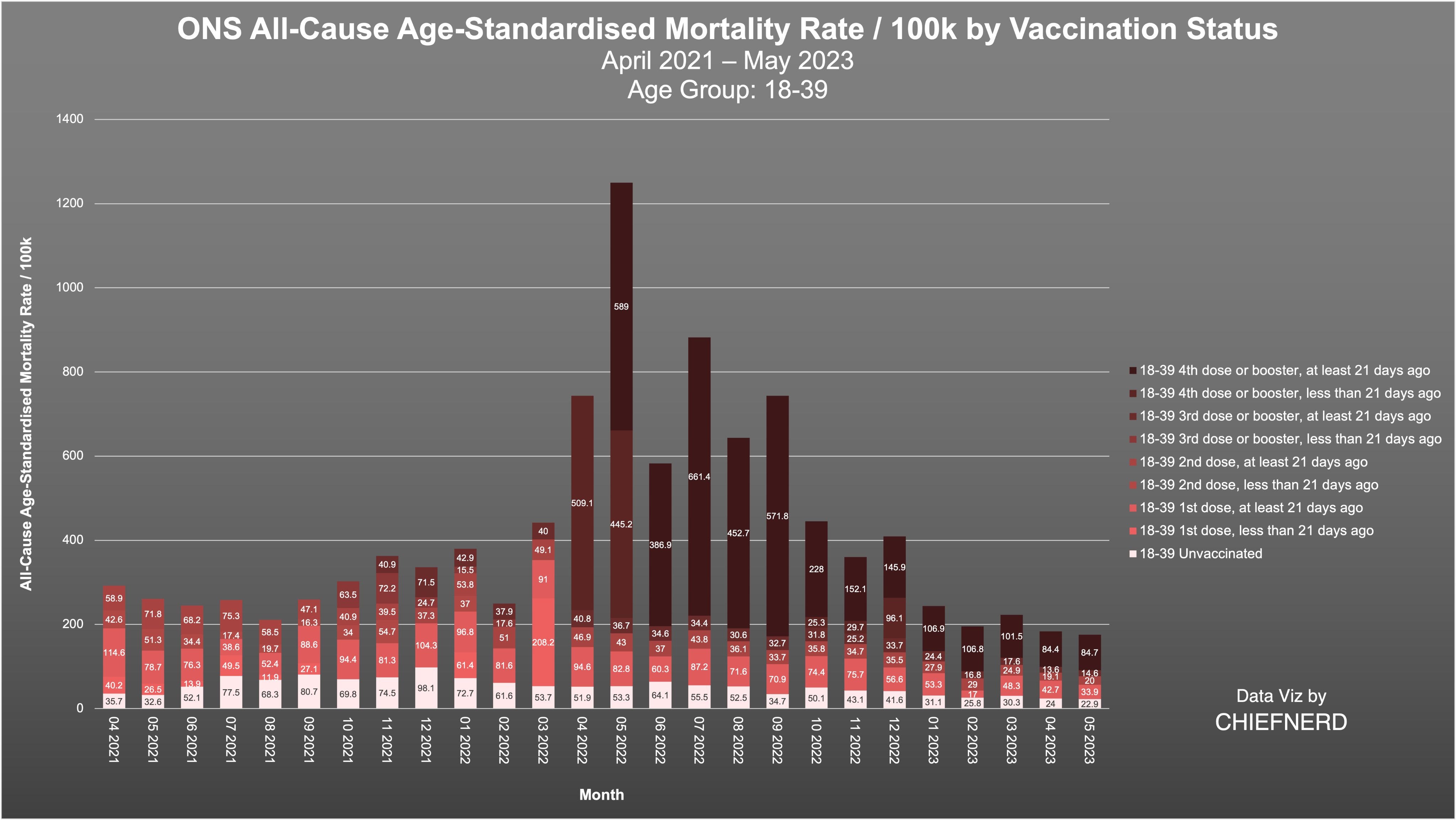
Well, I was feeling far too sane the other day and decided I needed a bit more bonkers in my life, and so I ventured onto TwitterX. I noticed a post by Chief Nerd which had a representation of the ONS data for the UK by vaccination status for the roughly 2-year period April 2021 to May 2023. Here’s one of the graphs (for the 18-39 year group).
Looks like a clear-cut case of vaccine harm right? Except someone else (let’s call him Jibby Jab, or JJ) commented and provided another visualization of, apparently, the same data.
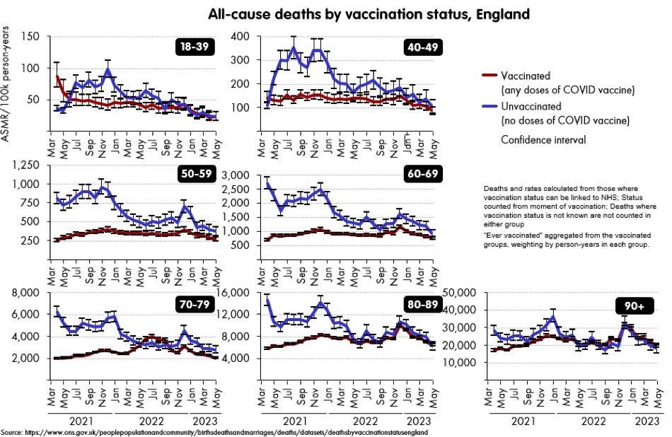
What the WEF is going on here? It would appear we have two diametrically opposed visualizations/interpretations of the same data (just looking at the 18-39 age group).
I chased down the data set that Chief Nerd (CN) used which can be found here. I checked some of the numbers in his charts and they match up with those in Table 2 of the ONS release. So there’s no cock-up in the charts of CN. Here’s the first bit of that Excel Table 2 from the ONS

I did note, however, that the graph titles and axis labels of CN are misleading. The actual plots are per 100k person-years, and NOT simply per 100k population size. It’s clearly stated in the Excel spreadsheet that the rates are per 100k person-years.
If you look at JJ’s chart for the 18-39 year group you can see that around December 2021 the age-standardized death rate (per 100k person-years) in the unstabbed is about 100, and about 40 for the stabbed (eyeballed). How do we get these figures from the data in the ONS spreadsheet which I’ve reproduced below?

These match CN’s chart, but not JJ’s. What I think has been done is the following :
Add up the stabbed deaths (3 + 53 + 3 + 231 + 37 + 56 + 3 + 3 = 389) and divide by the sum of the 100k person-years (which comes to about 9.36 100k person-years) and you end up with about 42.
So, which is the “right” way to represent this data; CN’s version or JJ’s averaging procedure?
At this point I realized I didn’t really have a weffing clue what a person-year was, or how to properly interpret any of these graphs.
I’m clearly missing some pieces - and nor do the tables from the ONS come with any helpful explanatory notes.
Person-Years
I fired up my (un)trusty Google and started to learn about what a person-year was, and how (and why) it gets used.
I know, I know, I’m putting myself in danger of being arrested by the Plod of Wokistan the UK for “doing my own research”, but needs must.
So, suppose you’re running a clinical trial for a year and someone drops out half way through? Do you just discard the data? The idea of a person-year is to accommodate this kind of situation. A person who drops out after 6 months would be said to have contributed a half person-year to the trial.
Similarly, if someone dies after being only 6 months into the trial then they contribute a half person-year.
If someone doesn’t get some medication (that is being tested in the trial) for the first 6 months, and then is given the medication for the last 6 months, then that person contributes half a person-year to each arm of the study - to both the placebo and drug arms.
Here’s a more formal definition from the University of Manitoba
A measurement of observation time per person and is often used as the denominator in incidence rates when, for varying periods, individuals are at risk of developing a disease, using a health service, or dying. Instead of using the number of people at the start of the observation period as the denominator, one can determine for each person the actual time at risk, from the beginning of the study period until the disease is detected, the person is lost to follow-up (i.e., moves out-of-province or dies), or the end of the study period. If a study period is one year and a person is disease free for the entire period then they will have a person-year value of one; while if another person develops a disease six months after the start of the study, they will have a person-year value of 0.5
You might get the idea from the above that a person-year is a measure of risk exposure. So, perhaps something like deaths per 100k person-years could be thought of a kind of death “per unit risk” measure? It’s still not overly clear though, but what about this averaging procedure used by the ONS that we can see in JJ’s charts?
Too Mean or Not Too Mean
Let’s imagine a trial to test the effectiveness of 2 new health supplements. We have a control group C who do not take any supplements, with group A taking one supplement and group B taking the other. We collect the results at the end of the trial and write it down in terms of person-years.
C : 100 deaths | 200,000 person-years | ASMR (per 100k PY) is then 50
A : 50 deaths | 50,000 person years | ASMR (per 100k PY) is then 100
B : 90 deaths | 300,000 person-years | ASMR (per 100k PY) is then 30
Based on these figures one would conclude that taking supplement A is not a good idea, but that taking supplement B might be.
But let’s apply ONS reasoning here and split things into non-supped and supped.
non-supped : 100 deaths | 200,000 person-years | ASMR (per 100k PY) is then 50
supped : 140 deaths | 350,000 person-years | ASMR (per 100k PY) is then 40
So based on “ONS-style” reasoning you’re better off if you take some supplement than none at all!
But What About The JISM1?
The supplement example above shows that averaging to suggest that you’re better off taking some supplement is rather questionable. This is a bit like what the ONS are suggesting when they take “ever vaccinated” and average the data. But it’s even less clear here.
Someone who has had the second dose has, by definition, also had the first dose, and so has contributed person-years to both the single dose group AND the double dose group (and so on for the various booster bonanzas). And if they got vaccinated part way through (as most were) then they’ve also contributed to the person-years for the unvaccinated group.
Whilst based on this ONS data it appears that in terms of person-years the 2nd dose offers a protective effect, the person-years for the first dose tell a completely different story.
I’m still in the process of getting my head round person-years and how to interpret them and I’ll probably want to play with the ONS data a bit more, but at the moment I’m not convinced by the argument that getting vaccinated is, on average, better than not.
There are other considerations. The ONS interpretation is that taking the vaccine improves All-Cause Mortality. OK - but the data is taken from a time period when covid was a minor blip on the pushing up daisy rate. So what’s the “vaccine” protecting you from? Strokes? Alzheimer’s? Heart attacks? Having a 3 ton block of vitamin D drop on your head?
Dunno.
There’s just something really dodgy about all of this. We’re seeing, according to the ONS interpretation, a doubling of the mortality risk (in ASMR per 100k person-years) in the 18-39 unstabbed group around the Christmas 2021 period. Why? They’re sure as shit not dying of covid are they?
The other issue I see is that those who survive to get the 2nd dose are, statistically speaking, likely to be that bit more robust. It’s possible we’re seeing survivor bias in the 2nd dose data which does (according to the person-year data) show a protective effect on ACM.
Another possible confounder here is HUB - the healthy user bias. It may be that people close to end of life and unwell might not be given the vaccine. This would have the effect of skewing the deaths in the unvaccinated a bit.
When I’ve figured out what a person-year is a bit better and I know how to calculate it theoretically with squiggles, I’ll hopefully have something more useful to say. But for the moment, I’m somewhat sceptical of both the actual data and the ONS interpretation of it.
If any of you kind folk people out there have a better grasp on person-years and find I’ve missed something or got something wrong, any suggestions and/or corrections would be greatly appreciated.
Jab of Incredible Safety and Magnificence
I'm sticking with the old saw that the point of stats is to make things understandable, legible and comparable with as little trouble as possible for the one looking at the finished stats.
And that saw is currently singing the "Obfuscation blues" - the only point of making something difficult to understand, or easy to misinterpret, is when you want to hide something.
Professor Rigger
I haven’t read past your first sentence, but I couldn’t wait to inform you that The Left, or as I prefer to call them, The Far Wrong, also consider themselves sane. But most of them aren’t insane, they just have different values. They don’t believe in free speech or that children should not be allowed to make adult decisions. And they don’t know what they don’t know. And they are too arrogant to learn.
And of course, they deny the obvious - ISLAM IS A CONQUEST IDEOLOGY and CLIMATE HAS ALWAYS CHANGED and THE FUCKING RUSHED EXPERIMENTAL “VACCINE” DIDN’T WORK AND IS SOMEWHAT DANGEROUS and OMICRON KILLED COVID.
Sorry for yelling but old people are often hard of hearing. I am.