
Models and Emperors (Part 2)

After writing my last post I thought it might be a good idea to run through an example of ‘modelling’ used to get some insights into overall patterns of ‘expected’ behaviour.
It probably sounds a bit NSS1, but it’s important to remember that, in general, the process of modelling isn’t really about the model itself2; it’s about what we’re trying to achieve with it. There is a first step that is usually not emphasized nearly as much as it should be in all of this kind of process - what question are you trying to answer?
Whenever I was going through ‘worked examples’ with my students - you know, those boring physics (or maths) style questions that most of us were traumatized by at school, the very first thing I opened with was asking the students what they were being asked to find3. Read the question (often quite lengthy) and get it fixed in your head what it is you’re trying to achieve/answer.
The next thing is to figure out what information you have (what is known) and then to figure out how to use that information to get the answer to the question. Broadly speaking, for typical school/college questions you’d be looking for an equation that looks like this
stuff you want to know = math expression involving stuff you know
There is an extra (and difficult to get used to) step that really ramps up our ability to understand things. This is to use letters instead of numbers. The dreaded algebra monster rears its head - but it’s really crucial if you want to develop a fuller understanding.
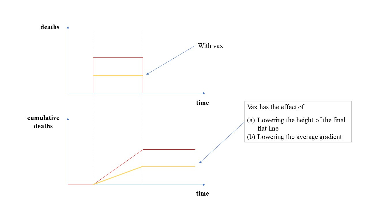
The goal today is to try to answer the question : what would we expect the cumulative death toll to look like with an effective vaccine?
What do we know? Well, we know the death data - the death numbers per day. Here’s the chart for the first ‘wave’ in the UK.
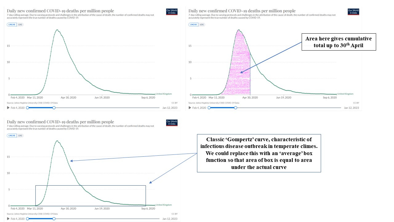
The actual curve is a kind of skewed ‘bell’ curve known as a Gompertz curve, which is a characteristic shape seen in infectious disease outbreaks in temperate climes. If we write the shape of this curve as a mathematical function, n(t), then n(t) gives us a number of deaths per unit time so that the number of deaths in a short time window Δt would be just n(t)Δt. The total death count can be found by adding this up over all time windows. This, of course, is what’s called integration. Integrating the function n(t) over some time interval, say a couple of months, will give us the total number of deaths (the area under the curve) in those two months.
At this point our modelling brain kicks in, as well as our laziness. Integration is difficult, in general. I have a lovely sticky and gooey brownie waiting, and some fresh ground coffee beans - I don’t want to spend all day trying to integrate the Gompertz function (and probably failing).
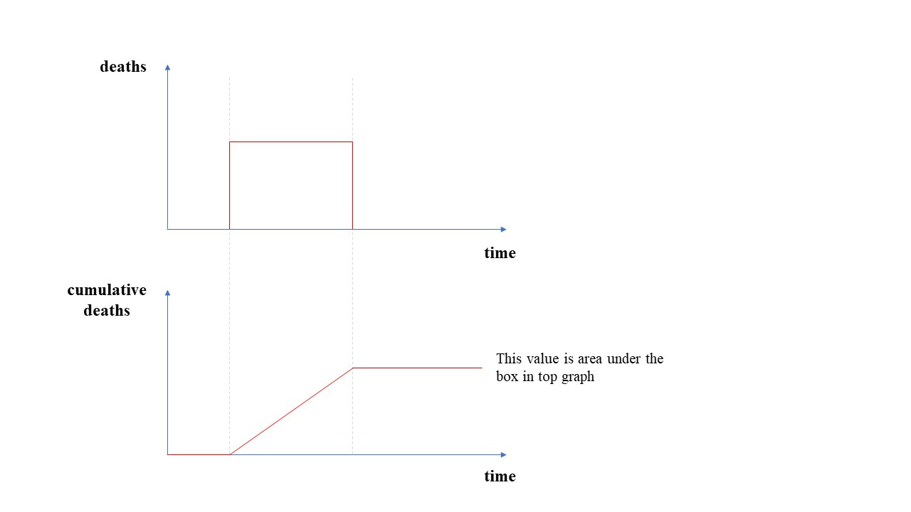
We recall that we’re trying to get some insight here - we want to get some idea of expectation. So, as a first stab, we’re going to replace that complicated Gompertz curve with a straight line to give us a kind of ‘box’ function. The area under the box will be the same as the area under the Gompertz function.
At a later stage we might want to refine our model a bit - maybe replace the Gompertz curve with a couple of back-to-back triangles so that the area of the triangles is the same as the area under the original curve.
Straight lines are easy to deal with - and ‘flat’ straight lines (like our ‘box’ function) are even easier. That coffee and brownie is beginning to get closer and closer. So, here’s what our first ‘wave’ and cumulative death toll looks like with our box model.
At this point, all sorts of little light bulbs are going off and causing seizures in the epileptically vulnerable. I’m going to be in coffee and brownie heaven in less time than I originally anticipated.
It has now dawned on me - and it probably should have dawned on me much earlier - that the actual shape of the death curve (the Gompertz curve, for example) isn’t going to be all that significant in answering our original question.
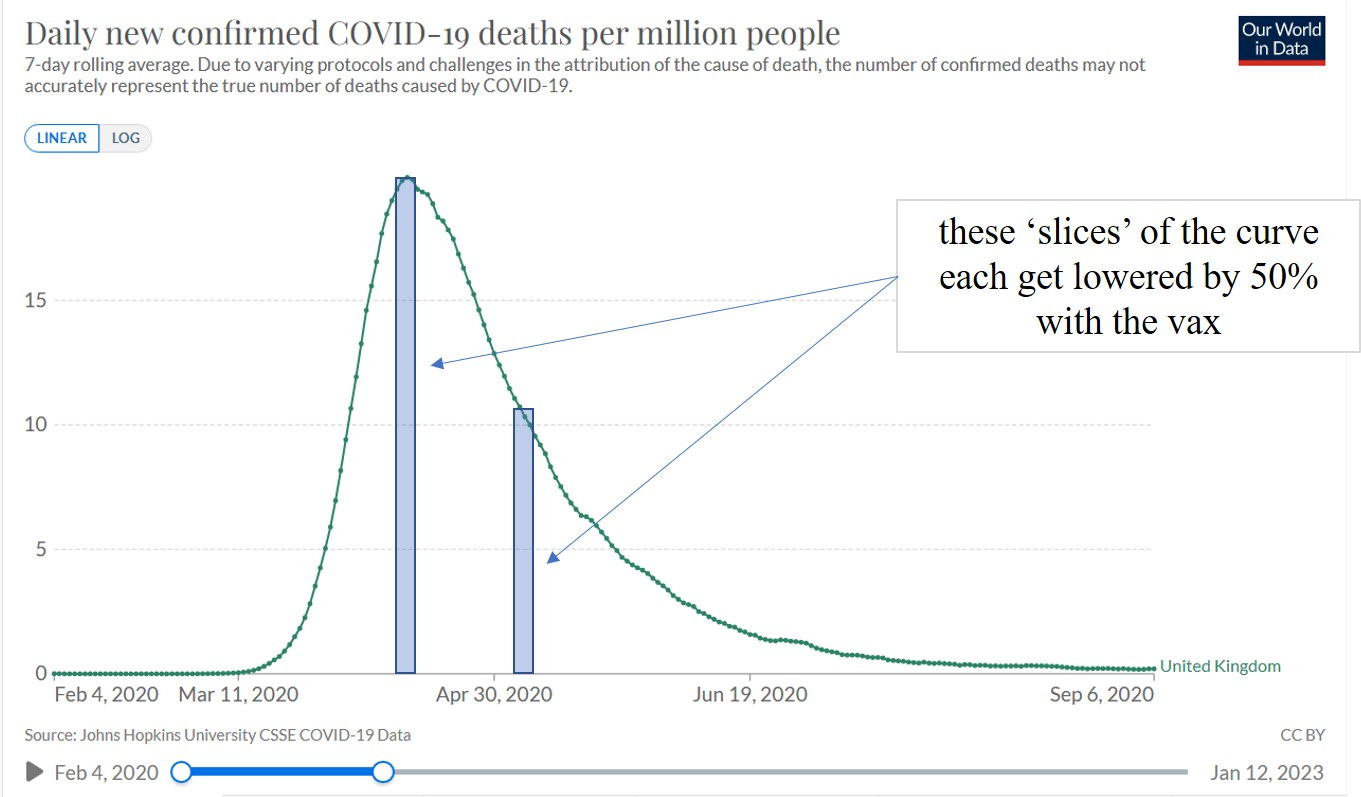
The vaccine effect is just going to act as a scaling factor4. We can see this with a simple example where we suppose the vaccine is 50% effective and without the vaccine we get 2 deaths per day.
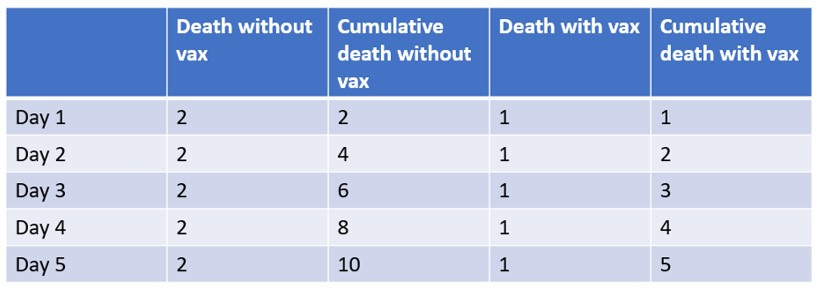
So, hopefully, you can see that the effect of the vaccine is just going to lower the death curve (whatever it is) - the shape will be unaffected. Just to drive this point home a bit (or maybe to labour the point a bit too much) with our 50% effective vaccine we have
So, we have our box model, and we have (belatedly) realised our vaccine is acting as a simple scaling factor, what’s the upshot of all this?
Here’s what we would get with the vax (applied before the outbreak)
I’m pretty sure most of you will have already figured all this out, even if you didn’t attach any fancy words and technical terms to it all I’m sure you have intuitively grasped all of this. So I’m sorry for the tutorial style here.
I wanted to try to give another example of how a simple ‘modelling’ process (part of my never-ending quest for simplicity) can potentially give us insights into important questions to ask. If we don’t see a cumulative death curve (post-vax) that has these characteristics, we need to ask why not?
Even if we do see such a (post-vax) reduction, how can we be certain it was the vax? After all, based on long experience with infectious diseases we know that 2nd or 3rd waves are less severe because of the influence of greater acquired immunity in the population (even if we don’t get to full ‘herd immunity’ this community immunity plays a significant role).
Simply observing a reduction is a necessary condition for vax effectiveness, but not a sufficient one. If we don’t see such a reduction in 2nd and subsequent waves (post-vax) then alarm bells should be ringing, the disaster flares need to be set off, because something is going very wrong.
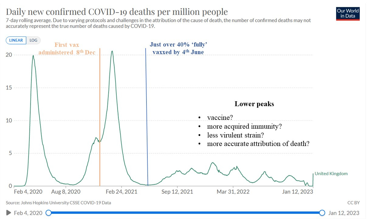
In the UK we did see a reduction post-vax, but can this be attributed to the vaccine alone? And the data here is crap anyway - because that 2nd wave seems worse than the first, but this is entirely due to the crappy data collection that misclassified deaths as ‘covid’ death (easily seen from a consideration of excess death).
It’s time for that brownie and coffee.
No shit, Sherlock
Well, you have to worry a bit about whether you’ve got it right, or whether your modelling approach makes sense
If Johnny swings his baseball bat at Peter’s head at a speed of 10 metres per second will this be fast enough to crack Peter’s skull? You must have answered those kinds of questions. I am, of course, being a bit sarcastic - if physics classes were based on these kinds of questions we might have more people interested in physics
Assuming everyone is vaccinated before the outbreak this will be a constant factor that can be applied across the outbreak duration. We’d have to include the time progression of vaccination in our model as well if we were vaccinating during the outbreak, but let’s keep things simple
Is that a normal swing in baseball? I admittedly have no idea. I do have practical empirical knowledge of using bats, clubs and such in real-life situations not involving baseball, and it's rare that you have the time and space to set up a real swing.
A short-bladed knife, double-edged, or a screwdriver with the head sharpened and kept in your pocket is much better.
I guess it's the same in physics really as in real fights: the fancy stuff rarely works, draws attention, and caneasily get you killed. The simple basics always work and keeps you alive.
I posted at the cathouse the other day (El Gato Malo), regarding why our agencies fail so hard at what you talk about here, and in the interest of saving an electron or two, I'll just shamelessly quote myself*:
"I think they fail so much and so hard because instead of trying to do empirically right, they try to do theoretically perfect."
*Just realised that the excusi-fying and all the rest also wastes electrons! Oh my, oh dear. To save the climate or to be impolite, what is a body to do? :)
should be a rap song...'I have a lovely sticky and gooey brownie waiting, and some fresh ground coffee beans - I don’t want to spend all day trying to integrate the Gompertz function (and probably failing)'.....