Just As We Expected
The ONS (Office of National Subterfuge) Strikes Again

Ever since a lot of nations went jab-happy there have been claims of “excess death”. The problem has been that since the roll out of the Sacred Shot of Deliverance™ more people have been dying than we would have otherwise expected. That’s very inconvenient of them - they need to stop doing that.
The ONS (Office of National Statistics) in the UK has been doing its best with its technical incantations to convince us that Bourla’s Beneficent Bounty™ has been wonderful - the best vaccine wot ‘as ever been made, don’t you know?
They claimed, for example, in a recent report (which mysteriously1 took ages to produce) that ACM (all cause mortality) in the UK was significantly lower in the stabbed versus the unstabbed. This effect persisted even when covid itself wasn’t doing all that much. This magic anti-Covid Goo was saving people from non-covid things - like falling off ladders, or cancer, or some such thing.
Yeah, right. Whilst it’s not clear whether there are some really significant biases the ONS, erm, conveniently overlooked, or whether they just got it wrong, it’s clear that the report needs to be treated with a considerable degree of scepticism.
But they’re at it again. This once respected and trusted institution is churning out more magical ‘analyses’. It’s sad to say, but these days it’s just as we expected.
Unfortunately, there’s nothing non-binary about death. You’re either poncing about, full of life, at some Pride parade, or you’re pushing up the daisies. If you’ve put away the fetish gear for one last time, then that’s it; no more gender journey for you - or journeys of any kind, except perhaps to the crematorium.
You can’t really linearly regress your way back to life. This has caused something of a problem for the ClotCult™; it makes the vaccines look bad, and we can’t have that, can we?
Whilst correlation does not equal causation, it’s hard to ignore the fact that since the vaccines “saved the world” more people have died (inconveniently and unexpectedly) than died of covid.
The witches and warlocks of the ONS have the answer. Do not sell your Pharma shares just yet. The solution is clear. Perform your statistical rituals, known only to the credentialed few, and the inconvenient curse of excess death can be magicked away.
More people dying than expected, you say?
Not a problem - we’ll just change what we expect to happen and then everything goes back to normal. All those unexpected deaths? We’ll just re-categorize them as expected.
Now, where have I heard about this re-categorization technique before? Oh, that’s right, when you want to make the latest PharmaFuckUp™ seem to be effective - reclassify those who haven’t been stabbed for very long as unstabbed.
Now I don’t know what statistical magic the ONS performed - I think I’m right in saying that it’s a trade secret known only to those initiated into the dark arts of the ONS - but the results it has produced are, shall we say, illuminating.
You’ll find more detail in the recent excellent piece by HART

HART correctly point out that any creation of an expectation (and not just when it comes to medical things) requires some kind of model to be produced. The details of any such model need to be properly understood. If, as we can see from the various Climate Models, your model-derived expectations don’t match reality, then there’s something you haven’t done right and you cannot, therefore, claim to have understood the problem sufficiently well.
My suspicion is that the ONS understand the problem only too well. It looks like they’ve been instructed to find a way to make the “excess death” problem go away.
I’m not going to try and argue that the simple arithmetic mean of the previous 5 years of death data gives us a fantastic measure of expectation. It doesn’t. It’s good enough for a first stab and it can tell us if something looks awry. And we shall see from the chart below that it’s not all that bad either.
For one thing, you have to account for demographic changes - which is why we often see terms like “age adjusted” or “population adjusted” - and these are necessary adjustments if you want to do things properly.
But even without knowing what arcane bit of wizardry the ONS employed, we can draw some conclusions.
Let’s take a look at a chart from the article by HART. It’s the graph comparing two models of expected death; one from the ONS and the other from OHID2. The OHID model uses an arithmetic mean and also does the necessary demographic adjustments. Here’s the chart (with my annotations) for the 50-64 year old group.
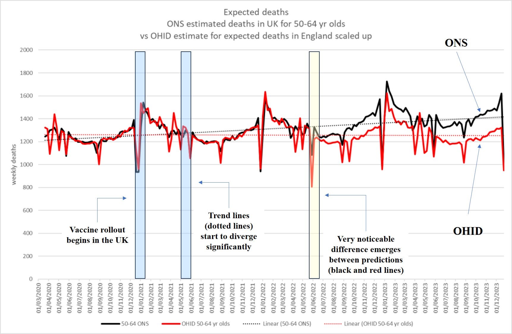
There’s a few things to note about this chart.
Note the reasonably close agreement of the two organizations in their modelling before around midway through 2022.
The large dips are artefacts of the registration process - we don’t suddenly have fewer people dying over the Christmas period. The figures are, then, drawn from date of death registration and not from date of death. This can be a serious issue as Joel Smalley has demonstrated.
What has caused the ‘sudden’ large divergence in the charts (the solid lines) from about June 2022 and onwards? Does this represent some major demographic shift that occurred around that time? Why do we, suddenly, expect to see more death from this point on?
And, just like that, the ONS are claiming that we should be expecting more death in the UK because reasons.
There’s a good reason why I’ve been expecting more death in the UK since around the start of 2021, but it’s not the one the ONS have magicked up.
Of the following two options which do you think to be more likely?
(a) the ONS have made an honest and genuine effort to remodel expected deaths to make it more accurate
(b) they’ve been instructed to find a way of modelling excess death that minimizes (or hides) the effect of the vaccines or the long-term lunatic lockdown consequences.
I know where I’m placing my expectation.
It took them a while to figure out the best statistical sleight-of-hand to use to give the illusion of vaccine efficacy?
The Office of Health Improvements and Disparities, which is another UK government agency
Here's how I model expectations using math:
A 25 meter tall Nordic spruce, dead and dried-out but still standing is felled by gusts topping 30m/s. It lands at a 45 degree angle, its top third caught in a cleft in a birch tree and its bottom end a rotted stump lodged in 1½ meter of snow. The end touching the ground is ½ a meter in diameter.
How and where do you cut to to:
A) Dislodge the entire tree?
B) Do so without danger to yourself?
C) Using only manual tools.
The difference between my model and the ONS is, if you mess up when applying it, you personally /will/ get hurt.
I wonder what would happen if you looked at the distribution of age-at-death (a generalized “life expectancy”) over time. If its central location is declining, then there’s “excess death”. No doubt insurance actuaries have such things, and have a powerful incentive to be correct.