I Chart in your General Direction

My last post had some pictures to remind us that we’re not in Kansas anymore - Lord only knows where the hell we actually are, but we need to tap the red shoes and get back home again.
In this post I’d like to discuss some of the charts, old and recent, that have been generated to illuminate (or obfuscate) the course of this (cough, cough) pandemic.
We’ll start with the absurd
1. The metastasization of modelling
Most, if not all, of our governmental response to covid19 has been as a result of models. These models have been mostly of 2 kinds.
(a) Technical and theoretical attempts to model what might occur. These have been almost universally incorrect - and sometimes incorrect by a couple of orders of magnitude.
(b) A mental model of what might happen. “Omicron is more transmissible, therefore we need to do something in order to save ourselves from it” - a sort of pull some scenario out of your ass approach and use it to generate fear. Isn’t it fascinating that the direction has always been towards more fear, and never towards calming things down?
It’s kind of similar to thinking that we’re all in serious danger of being struck by meteorites and so we need to re-build everything underground, one mile down, in order to save ourselves from this event that might happen. (Of course, this might actually happen one day in the future if some humungous asteroid wings its way towards us - but I would like to think it would be based on some decent evidence, rather than just a generalized vague fear)
The first one is a very recent chart used by The Telegraph to try to frighten us into thinking there might be 1 million cases of Omicron per day by Christmas in the UK (this is what the headline stated). I can’t even begin to describe how scientifically illiterate this asinine chart actually is.
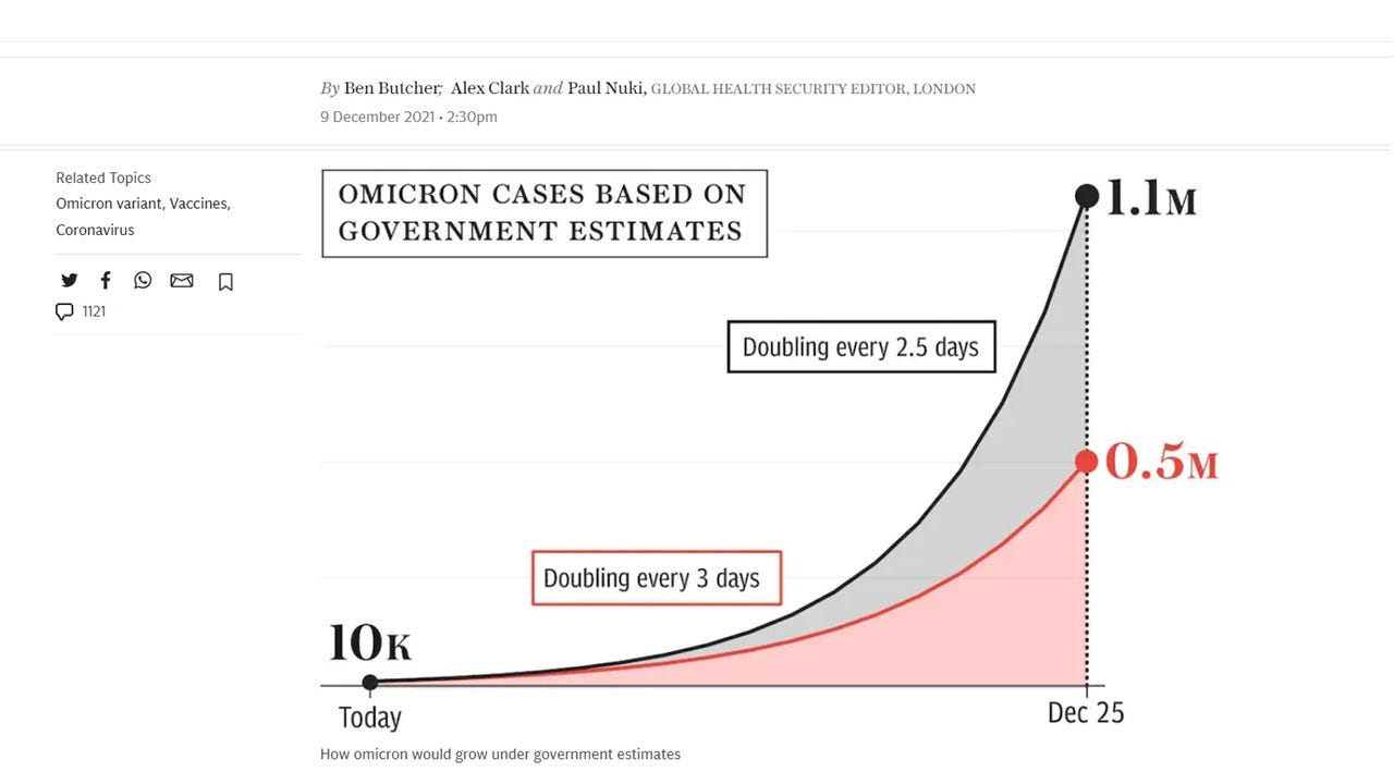
If we follow the authors’ “logic” here, then just 20 days after this we’ll have over 256 million cases per day - so that everyone in the UK will have, on average, over 3 simultaneous infections with the same virus on that day.
But how have the so-called experts fared? Here’s a chart showing how the expert predictions have described anything but reality
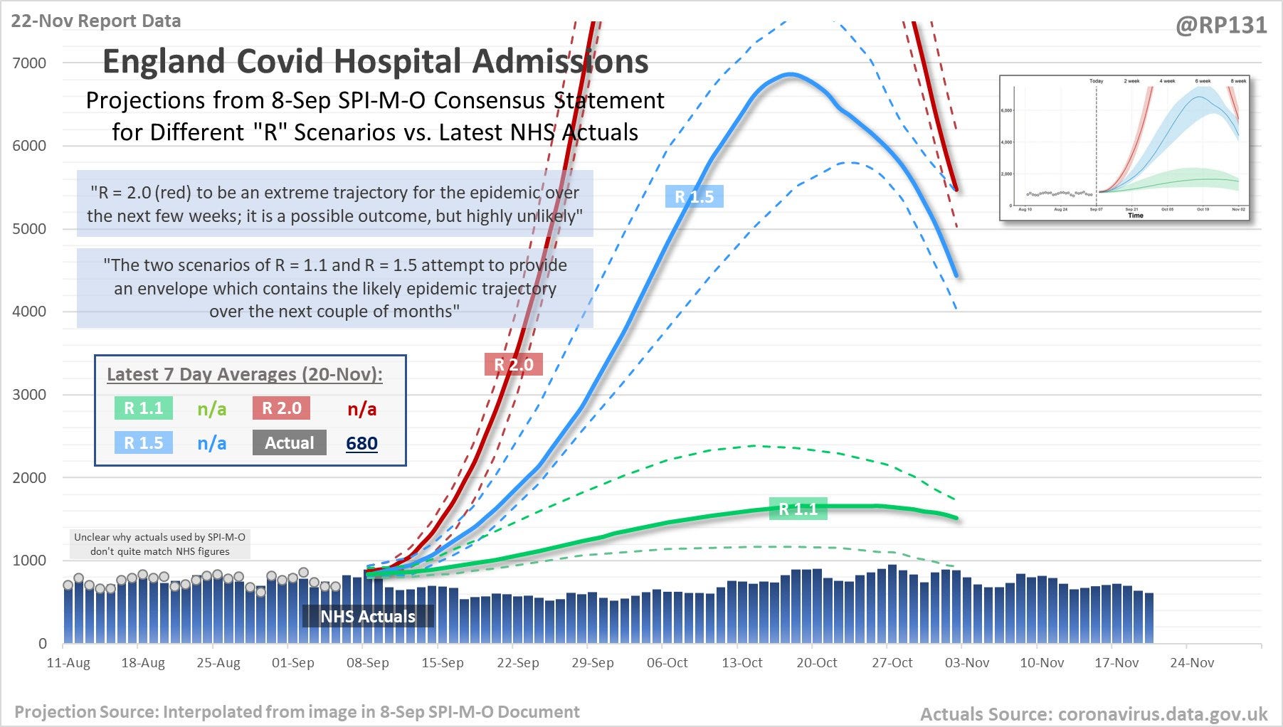
Alas, the “experts” can’t get it right either.
I use models all the time in physics - they’re not necessarily a bad thing. They are great ways to get some insight, provided you check them against reality to see if they are a reasonable match.
It’s very strange to me, as a physicist, to see these “experts” get it SO wrong, again and again and again. What the hell are they doing? Do they just keep sticking new numbers into the same old shit that didn’t work the first time? Don’t they ever stop to think there might be something wrong with their models and the assumptions used to build them?
2. It’s a super-duper deadly, fight-them-on-the-beaches, virus
I generated a chart a while back as a fun quiz to see if people could spot 2020 on the chart of UK age-adjusted all-cause mortality for the last 2 decades.
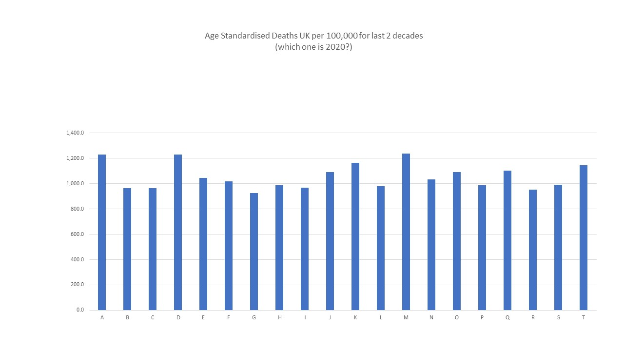
The answer here is E. Really sticks out doesn’t it? Try it on your friends to see if they can spot the year the “most deadly pandemic since Spanish flu” hit us. See if they can spot this “unprecedented health crisis”.
Of course - some will say it would have been worse if we hadn’t locked down. OK - fair point. So if we find a country that didn’t lock down, their pandemic year 2020 should stick out like a sticky thing with extra sticky bits?
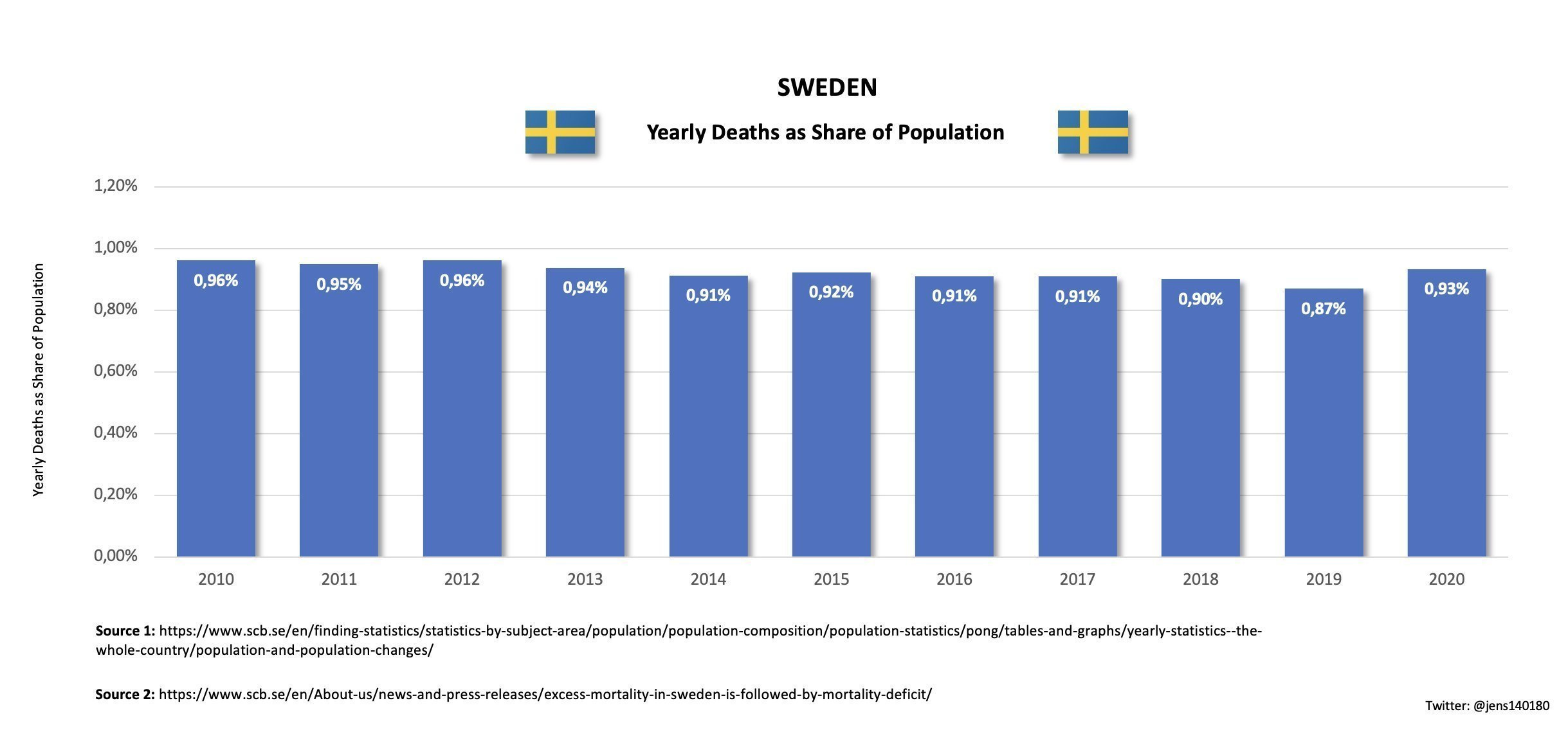
You mean this sticky out thing at the end of the chart here? It’s not even a semi, guys.
By any rational analysis, covid19 does not represent a health emergency at a population level.
3. You’re all going to die if you don’t take the Glorious Goo
There is a very skewed perception of the danger of covid - particularly when it comes to healthy working-age people. Many people seem to think getting covid is like some sort of death sentence.
The following chart I generated shows the cumulative percentage of total (covid) death for the different age groups over the first 2 seasons of covid. The title of the chart is a bit misleading - it is percentage of total covid death - so bear that in mind.
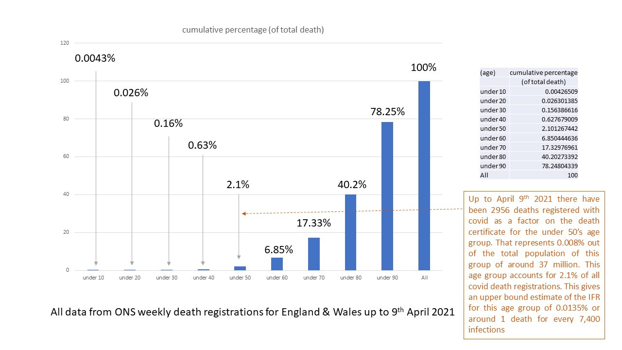
So 97.9% of the people dying from covid have been over 50, and 99.84% of people dying from covid have been over 30. The numbers can be seen in the following table which presents the data in a slightly different way.
In this chart I tried to estimate the age-dependent IFR by assuming an overall IFR at a population level and using the official ONS registration data (significantly inflated covid death count). Apart from the death counts themselves, these figures are only estimates.
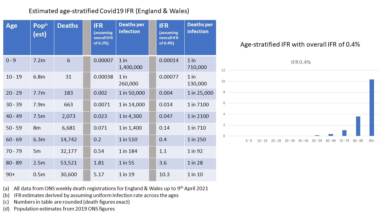
Whilst one might quibble at the estimates, they are very much in the right ballpark - and a little on the high side because I’m using the inflated government figures for covid death.
It’s also important to note that the death figures include all those with co-morbidities, so if you’re healthy, your risk is going to be much lower than these figures indicate.
If you’re under 70 and in decent shape, it’s not looking much like any kind of “emergency” is it? Serious, perhaps, as you push up towards 70 - but we also have to remember that we haven’t, in the UK and elsewhere, done a great job of trying out promising early treatments.
4. Horse Paste and Fish-Tank Cleaner
One of the weirdest things has been the almost maniacal dismissal of promising early treatments. Actually, we shouldn’t get too fixated on a single apparent “wonder-drug” because what’s really important is that these things get used as part of an overall protocol. Covid19 progresses through stages, and different treatment regimes are required at each stage. These protocols are carefully thought out, evidence-based, multi-drug approaches that really do seem to make a significant difference.
They weren’t just plucked out of thin air (like the numbers used by the modellers), but there were good medical reasons for trying out each of the various re-purposed drugs. There were good a priori reasons for thinking they would help against covid19.
What’s even more weird is that these drugs are not just dismissed, but vilified and lampooned. Ivermectin, for example, gets described as “horse paste”, or some equivalent. Kind of bizarre for an extremely safe drug that has saved millions of people from river blindness. People - not horses. The fact that it also has veterinary applications is a bonus, surely?
The dismissal of the evidence for these drugs is extremely concerning. In Matthew Crawford’s excellent articles on covid you can find the following looking at the trials on HCQ. The green here indicates a trial which demonstrated a positive, beneficial, outcome. The red indicates a trial which did not find a beneficial outcome.

You’d think, wouldn’t you, that a result like this would be welcome news - and not just welcome, but celebrated the world over? Here’s a way of reducing covid death - and even if it was only 20% effective, say, that would represent over a million people we could have saved from a covid death, worldwide.
Yet this good news is treated with scorn and derision. Physicians are prevented from even trying this treatment. We know HCQ is very safe - so why not try it? Whatever happened to the much-vaunted precautionary principle we apply for mask wearing? If it reduces the risk even a little bit, it’s worth doing?
Of course, we all know at least a partial answer to this; these re-purposed drugs are off-patent and Big Pharma can’t make significant profit from them. They need to be discredited in favour of the Glorious Goo.
5. And what about the Glorious Goo itself?
There does seem to be some indication that the GG (the vaccines) has some temporary benefit in reducing covid death - although I’m a little hesitant to state that as a proven fact. It seems to make things worse to begin with, then confers some benefit which rapidly wanes and might even become worse again.
What seems to becoming more and more clear, though, is that if you look at the bigger picture and ask “has the Glorious Goo helped us overall?” things are much more concerning.
This shouldn’t surprise us at all, in fact. Even in the initial trial data provided by Pharma it is clear that if you don’t just focus on covid, but on all-cause morbidity, participants in the vaccine arm were less well, overall, than those in the placebo arm. You can see for yourself here.
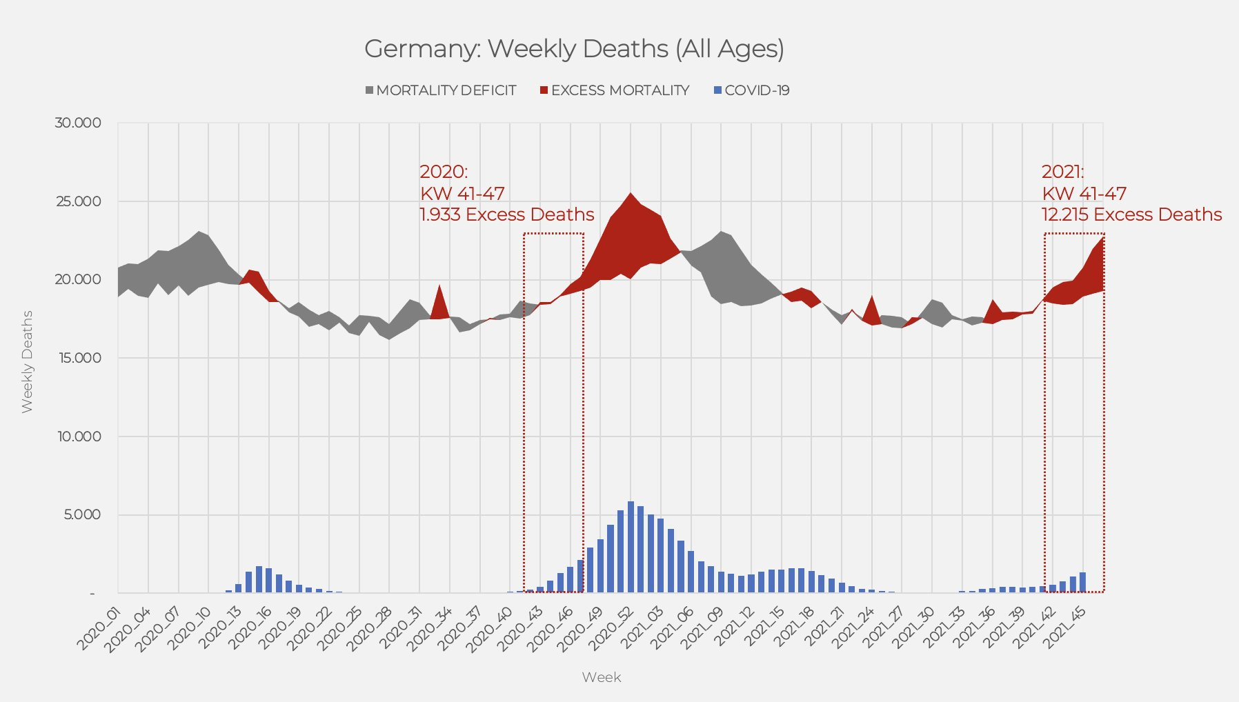
The conclusions from this paper are being borne out by real-world data too. Here’s a chart showing the situation in Germany pre and post the injection of the Glorious Goo.
We can see a very interesting trend in the Scottish data for excess mortality too
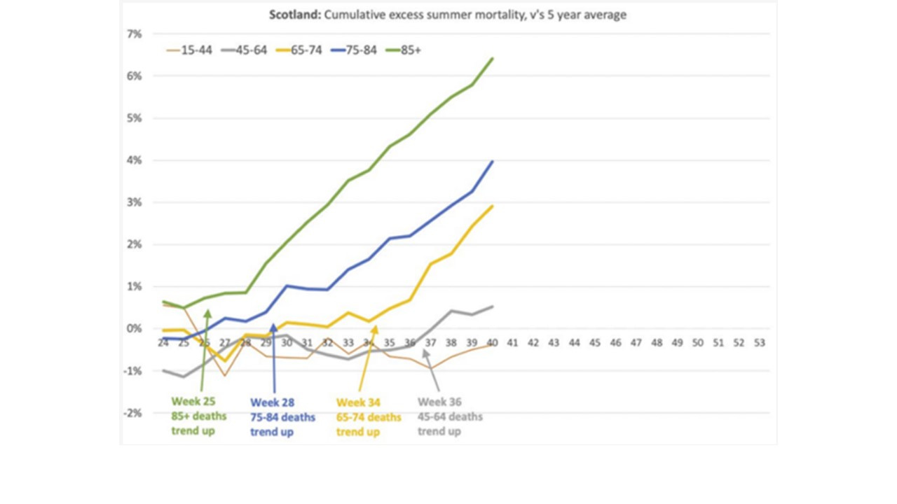
The age-staggered effect here is very interesting. This can also be seen in the UK data where we see a bump in the all-cause mortality for the unvaccinated that is age-staggered. The only consistent explanation for this is that the unvaccinated are suffering from excess death caused by other people getting vaccinated - which makes no sense, until you realise that people are still considered to be “unvaccinated” for a period of time after receiving a jab.
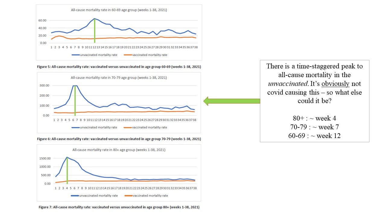
We can also see a similar trend in excess all-cause mortality in the following chart, here expressed as a percentage of the previous 5 year mean
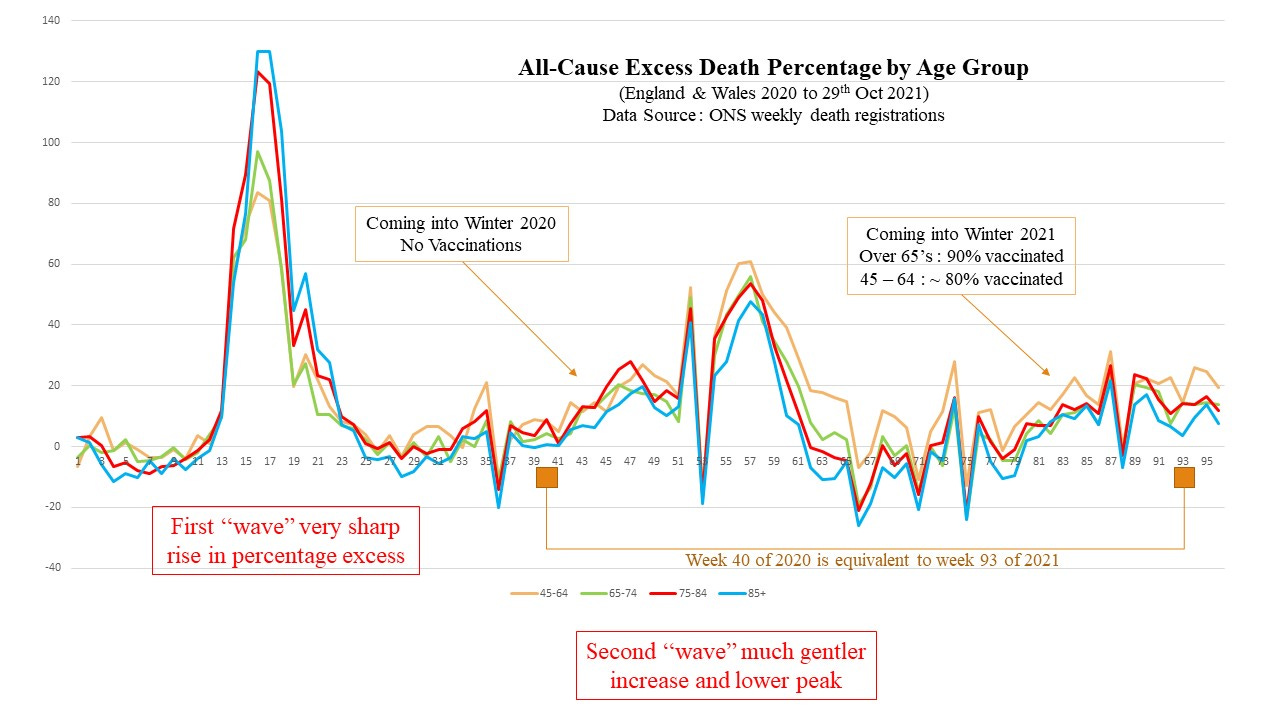
This chart also shows us the much lower impact of the 2nd covid season, as we would expect. It’s obvious there is a greater degree of community immunity dampening things down - which is the principal reason why the first chart from the Telegraph claiming 1 million cases per day by Christmas is such arrant nonsense.
The Glorious Goo might be having some impact on reducing covid death, but it doesn’t seem to be improving things overall.
To drive the point home still further here’s a chart provided by the excellent eugyppius (another substack on covid that’s well worth following) which is generated from the latest UKHSA data

Note the difference in gradient between vaxxed and unvaxxed here.
If a picture paints a thousand words - these charts paint an entire library.
Excellent and very entertaining, the way that evidence should be presented and the ridiculous made apparent!
(I have some reading to catch up on, I noticed. I literally had to take a break from everything COVID for a few days.)
The Telegraph chart made me LOL. Good for them. Reminds me of a graphic I saw on another paper's website that purported to show how covid spreads using a bunch of little dots that bumped into each other and changed color. If people can look at such things and think, "Brilliant! Now I understand viral transmission," no wonder they consider themselves experts on the Glorious Goo because they read about how messenger RNA works in the Times.
I guess they have to "model" because if they presented actual data (as in the rest of the charts you show), they couldn't claim the sky is falling and that the only cure is the GG.