
Feelings Matter

One of the things you learn to do, or should learn to do, when doing a technical science-based degree is to ‘feel’.
It’s not exclusive to science, or higher education for that matter - it’s a useful life-skill for everyone1.
Of course, I’m not talking about the kind of feelings that lead to the wibbly-wobbly meltdowns of those with more ‘progressive’ values2.
I’m talking about getting a ‘feel’ for the rightness/wrongness of something.
If someone told you the mass of the Earth was a billion kg you might think this sounds about ‘right’. It is, after all, a very large number. But this number is out by 15 orders of magnitude3. The mass of the Earth (in kg) isn’t some number followed by 9 zeroes, it’s some number followed by 24 zeroes.
Even Professor Neil Randomson of Imperial College doesn’t get his predictions out by that much.
In my experience it was actually quite difficult to get students to automatically do this kind of thing. They’d scribble furiously, their fingers would be a blur as they typed into their calculators, and out would pop The Answer™. Could I get them to look at their answer and make some assessment about whether it ‘felt’ right? You’d have more success getting Sam Harris to admit that Trump isn’t the very incarnation of the bastard love-child of Hitler, Mao and Beelzebub as a result of some demonic trinary coupling (in alignment with progressive rejections of the sex binary).
So, you’d get students studiously writing down an answer for the current in a wire, after some calculation, that was of the order of 100,000,000,000,000,000 Amps (Yes, this happened). According to the National Weather Service in the US a typical lightning flash is about 30,000 Amps.
I used to set a question about a bouncing ball being dropped from some height (say 2 metres, for example). It would lose a certain percentage of its energy (sometimes I’d use speed instead of energy) after each bounce. I would ask the students the height it would reach after the third bounce. A decent fraction of the class would end up with a negative answer. This would mean that after the third bounce the ball crashes through the floor.
I never had a single student look at their negative answer and think “maybe I’ve made a mistake here”.
I even tried to encourage them. Look, I would say, it’s easy to make a mistake. I make them all the time and it’s even easier to mess things up in an exam situation. If you do recognize you’ve made a mistake and can tell me why it’s a mistake, even if you can’t figure out where you’ve gone wrong, you’ll get extra credit.
Nope. Didn’t work, in the main. They’d stubbornly type robotically into their calculators and just accept whatever answer this little box of horrors came up with.
I’m very much of the view that calculators in schools and colleges should be wired to the mains to give a small electric shock - so that the students would reach for them only when it was really, really necessary to do so4.
This ‘feeling’ of wrongness typified my experience of the ‘pandemic’. Nothing ‘felt’ right about the various interventions and diktats of governments. The data on the ‘vaccines’ doesn’t ‘feel’ right.
Indeed, the other day I was trying to think of something the UK government got right about covid and how to handle it. I couldn’t think of a single thing. Lockdowns, masks, social distancing, business closures, the effective closure of hospitals for non-covid conditions, nursing homes, asymptomatic transmission, fomite transmission, closing parks and park benches, making people stay inside, plastic screens everywhere, track and trace, mass testing of asymptomatic individuals, the identification of a positive PCR with an active ‘infection’, covid and vaxx ‘passports’, and more.
Not. A. Single. Fucking. Thing.
At one point these utter pillocks even offered the UK population advice on the ‘safest’ sex positions5 during the covid era.
My scientific ‘spidey sense’ went all tingly again when I was reading a piece on Stephanie Brail’s Wholistic Substack the other day.
It’s a nice piece that tries to find some balance between the ‘pro’ and ‘anti’ covid Goo positions.
But I was struck by the first example used, and it’s this that set my spidey sense off. It’s a graph from the Daily Mail which claims to show how well the vaccines have done.

Look at the data around Dec 2021
The graph is saying that “age-standardised” deaths, from all causes, were around 2,000 per 100,000 unvaxxed people and about half that for vaxxed people, for around a month.
DaPhuq is this gibberish?
Typically in the UK, as a broad rule of thumb, we have 10,000 people dying each week. If we underestimate the UK population to be 50 million, this translates to a death rate of 20 deaths per 100,000 people.
Even if we’re charitable and say they just made a small slip and got the y-axis scale out by 2 orders of magnitude, the fact that vaxxed people die at half the rate of unvaxxed people, from all causes, during a time when covid was not a huge issue is questionable, to say the least.
Healthy vaccinee effect, different age demographic, wibble, wibble, wibble.
I’m not buying it.
Twice the death rate - when covid wasn’t a major contributor to overall deaths?
There’s some chicanery going on here. It certainly doesn’t ‘feel’ right to me.
So, what are the numbers? How do we get a ‘feel’ for the kind of issues involved here?
Developing our Feelings
[The TL;DR is at the end if you want to skip the next bits which have a LOT of numbers. I’ve had fun working all this stuff out, but I don’t reckon you lot are quite as irredeemably weird as I am]
In order to begin to build up a bit of an insight we’re going to use a simplified ‘model’ of the UK population. Actually, I’m going to just look at the population of England & Wales, because I already have some of those numbers to hand.
The E&W population, according to the 2019 ONS estimates, is around 60m. This splits up as follows
‘Young’ [ <50 ] : 37 million
‘Old’ [ >50 ] : 23 million
This means that about 62% of the population of E&W is 50 or below and about 38% is aged 50 or above.
We can also split the population into U and V (unvaxxed and vaxxed, or unclean and virtuous - you decide). Week 44 of the UK’s vaccine surveillance report looks like this

Admittedly, this is for dose 2 of the Goo, but we’ll run with it. We’re only trying to get a ‘feel’ for the numbers involved - we’re not trying to be ultra-precise.
So, eyeballing these curves and doing a rough-and-ready estimation, we’re going to say that we have
‘Young’ [ <50 ] : 60% vaccinated
‘Old’ [ >50 ] : 90% vaccinated
I won’t bore you with the details, but this means we can split the population into the U and V categories as follows
Unclean : 2.3 million wrinklies and 14.8 million smoothies
Virtuous : 20.7 million wrinklies and 22.2 million smoothies
So, in the unvaccinated population 13% are ‘old’ and 87% are ‘young’
In the vaccinated population 48% are ‘old’ and 52% are ‘young’
It also works out from these figures that 28.5% of the total population is unvaxxed and 71.5% of the population is vaxxed.
Just a word of caution here, a reminder, that these are not exact figures - but just rough ‘rule of thumb’ figures derived from estimates. We’re only trying to get a rough idea of the kind of numbers and percentages involved.
You can see the problem here. How do we compare the populations U and V? Population U is almost 90% young and 10% old. Population V is about 50/50.
The usual way to compare two populations that are demographically different is to perform some kind of ‘standardization’. You have some notional ‘standard’ demographic and you adjust your populations to match this ‘standard’. So if you have some effect X (in this case death) you take your population of interest and ask what X would I have seen if my population was a ‘standard’ demographic?
By doing this, you can directly compare the impact of X on two (or more) demographically different populations.
The question I’m really trying to answer is, more or less, the following :
Is it possible, with appropriate ‘standardization’, to have overall death rates twice as high in population U when population V has some ‘protection’ against a disease that contributes, say, 10% to the overall death rate?
You’ll be pleased to know that I’m not going to address this algebraically. I might save that for another piece. But let’s see if it all makes sense when we put in some (semi) realistic figures.
First off we’re going to need some ‘typical’ death rates.
In a typical ‘standard’, non-pandemic, year you’ll get around 5% of the total deaths occurring in the under 50’s and around 95% of the deaths occurring in the over 50’s. Not an exact figure - but a decent enough ballpark figure.
Let’s go with our previous ballpark figure of 10,000 deaths per typical (non-pandemic) week (it’s a little more more than this). This means that every week you’ll have 9,500 old deaths and 500 young deaths.
What does this ‘typical’ non-pandemic death rate translate to for the various populations?
Population U
Total population : 17.1m
Old population : 2.3m —→ 950 deaths per week
Young population : 14.8m —→ 200 deaths per week
The overall death rate in this U population is about 6.7 deaths per week, per hundred thousand.
Population V
Total population : 42.9m
Old population : 20.7m —→ 8,550 deaths per week
Young population : 22.2m —→ 300 deaths per week
The overall death rate in this V population is about 20.6 deaths per week, per hundred thousand.
The death rates (the same for both populations U and V) here are
Old : about 41 deaths per week, per hundred thousand
Young : about 1.35 deaths per week, per hundred thousand
The overall death rate for the population as a whole (combining both U and V populations so we have 10,000 deaths per week from 60m people) is about 16.7 per week, per hundred thousand.
We need to take a bit of a breather here because you’re probably, like me, seeing various numbers swim before your eyes and you’re starting to lose track (and quite possibly the will to live).
The point I’m going to be driving at is that because we have assumed the same rates (non-pandemic ‘typical’ rates) we will arrive at exactly the same death rates for the U and V populations when we ‘standardize’.
I won’t demonstrate this - you’ve already suffered enough. Where age standardization matters is where there is a difference in the rates between the 2 populations.
What is going to ‘cause’ a difference? Well, if you have some Chinese engineered super-bug floating around and the Pfabulous Pfolk at Pfizer have engineered some Goo that buggers up the bug, then we might see a difference. We will assume that the Goo doesn’t have some miraculous property that reduces the impact of non-pandemic deaths in the jabbed (getting the Goo shouldn’t lower the risk of death from dementia in the jabbed, for example. Nor would we expect it to lower the risk of dying in a car crash).
In this situation we’re going to have
death rate in U : ‘typical’ non-pandemic rate + bug death rate
death rate in V : ‘typical’ non-pandemic rate + reduced bug death rate
Our Populations U and V during a panicdemic
Now we’re going to need some ‘handle’ on the effect of the bug across our population. We can get some idea of this from looking at ‘official’ data and working out an age-related IFR. I did this some time ago and produced the following chart from the ONS data for E&W
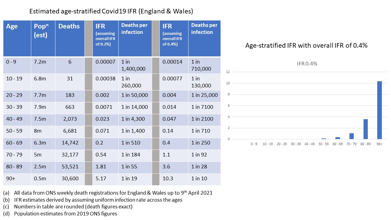
Eyeballing this chart, let’s make the wild estimate of 1 death for every 10,000 infections in the under 50’s and 1 death in every 100 infections for the over 50’s. I could work this out more accurately but, again, we’re interested in the ‘feelz’ here - we’re just looking to get some broad insight.
This, still, isn’t quite what we need here. Let’s go a bit wild. The ‘wildness’ is all in favour of making the Goo look good, so let’s run with it.
We’re going to assume that the panicdemic lasts for 4 weeks and during that time everyone gets infected. I told you I was going to go wild.
Wild Scenario : Populations U and V, Panicdemic, Goo quite good
The Goo has been liberally squirted into people’s arms - and it is 70% effective. The little bugger of a virus hits for 4 weeks and in that 4 weeks we get
Population U
Total population : 17.1m
Old population : 2.3m —→ 950 ‘typical’ deaths per week + 5,750 bug deaths per week
Young population : 14.8m —→ 200 deaths per week + 370 bug deaths per week
Old death rate : 291 per week, per hundred thousand
Young death rate : 3.85 per week, per hundred thousand
Population V
Total population : 42.9m
Old population : 20.7m —→ 8,550 ‘typical’ deaths per week + 15,525 bug deaths per week
Young population : 22.2m —→ 300 deaths per week + 165 bug deaths per week
Old death rate : 116 per week, per hundred thousand
Young death rate : 2 per week, per hundred thousand
We can see here how the death rate (the death rate for each sub-population ‘survives’ standardization) can, indeed, be double when comparing the U and V sub-populations . . . but we’ve made a rather wild assumption. The wild bit comes about because we’ve imposed a condition in which everyone is infected and with the assumed IFR we’ve arrived at a case where bug deaths per week are six times higher than ‘typical’ death in the Old (unvaccinated) population.
What actually happened?
In terms of percentage ‘excess’ caused by covid (aided and abetted by the policies regarding things like nursing homes and midazolam and ventilator usage) the graph looks broadly like this
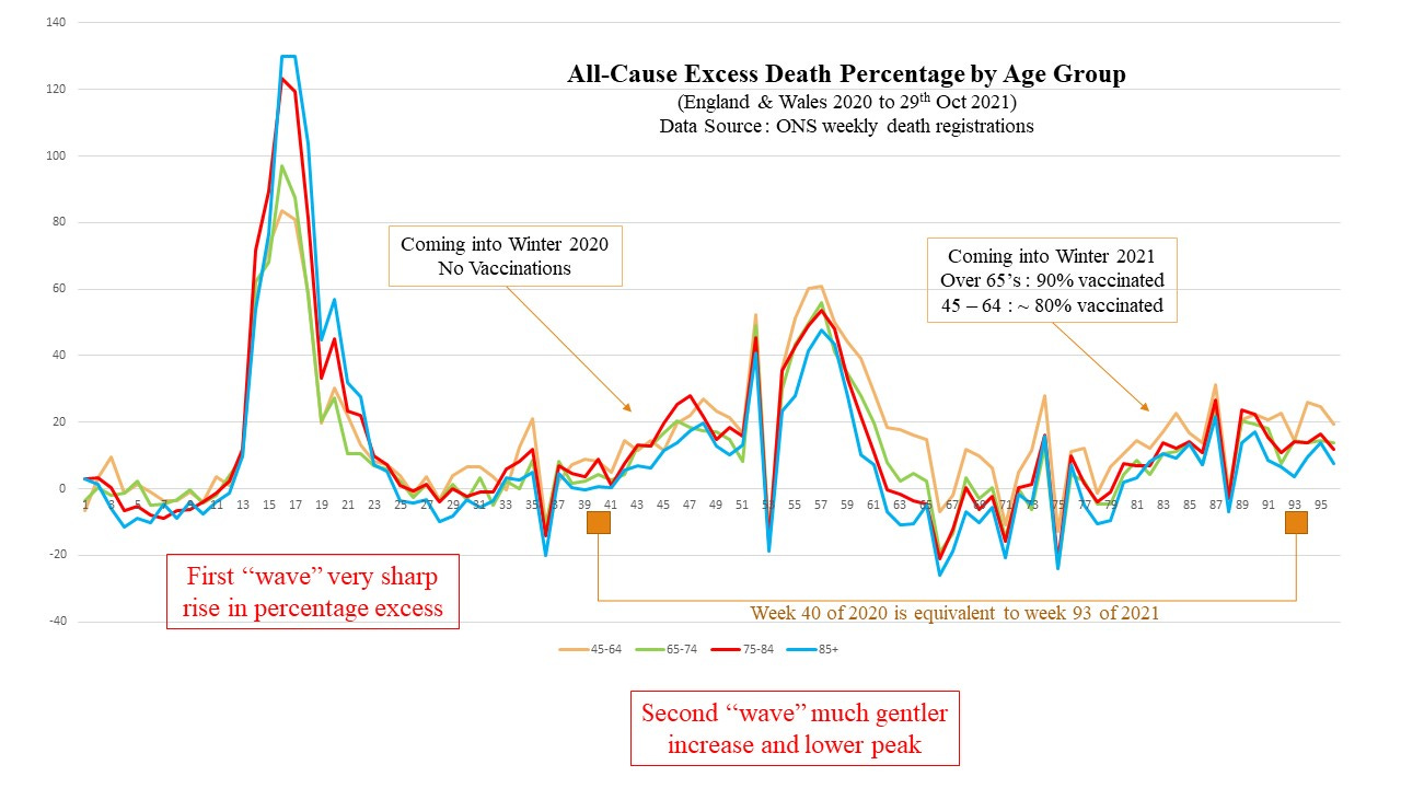
So, even during the first ‘wave’ at its height, covid (or covid + crappy policy) caused an excess above ‘typical’ of below 150% in the most vulnerable (the elderly) population. OK - this graph is derived using the crude (but common) 5 year average to derive the ‘baseline’ - so it’s not going to be perfect - but it’s also not going to be out by a huge amount. We’re certainly NOT going to see a 600% increase above the ‘typical’ even with a more sophisticated method for deriving the baseline.
More Realistic Scenario : Populations U and V, Panicdemic, Goo quite good
We’re going to be a little less wild and assume that, at its worst, the panicdemic lifted the baseline figure by 150%, and not 600%. How is this going to affect our calculation of death rates?
Population U
Total population : 17.1m
Old population : 2.3m —→ 950 ‘typical’ deaths per week + 1,425 bug deaths per week
Young population : 14.8m —→ 200 deaths per week + 300 bug deaths per week
Old death rate : 103 per week, per hundred thousand
Young death rate : 3.4 per week, per hundred thousand
Population V
Total population : 42.9m
Old population : 20.7m —→ 8,550 ‘typical’ deaths per week + 3,847.5 bug deaths per week
Young population : 22.2m —→ 300 deaths per week + 135 bug deaths per week
Old death rate : 60 per week, per hundred thousand
Young death rate : 1.96 per week, per hundred thousand
So, the Goo is still doing a good job with these assumptions and leading to a decent cut in the death rate - and, somewhat surprisingly, not too far off a factor of 2 in the Old group.
So we ‘feel’ for the Mail?
Not quite. The problem here is that we’re only able to get this factor of 2 (or not too far off it) by assuming that covid is contributing to a more than doubling of the ‘typical’ death rate. This was true for the first ‘wave’ - we had over twice as many elderly people dying, per week, as we would typically expect. This in my view was a combination of covid + disastrous policy decisions.
HOWEVER
The situation in Dec 2021 was nothing like the first ‘wave’. Covid (or covid combined with crappy policy) didn’t even come close to doubling the ‘typical’ death rate. Let’s assume it was much worse than it was and say that it caused a 25% jump in the death rate during December 2021. Here’s what the figures look like now
Population U
Total population : 17.1m
Old population : 2.3m —→ 950 ‘typical’ deaths per week + 237.5 bug deaths per week
Young population : 14.8m —→ 200 deaths per week + 50 bug deaths per week
Old death rate : 52 per week, per hundred thousand
Young death rate : 1.7 per week, per hundred thousand
Population V
Total population : 42.9m
Old population : 20.7m —→ 8,550 ‘typical’ deaths per week + 641.25 bug deaths per week
Young population : 22.2m —→ 300 deaths per week + 22.5 bug deaths per week
Old death rate : 44 per week, per hundred thousand
Young death rate : 1.45 per week, per hundred thousand
So, with a quite good Goo, and even with a more serious ‘covid’ than we actually had in Dec 2021, we’re no longer getting even close to factors of 2 for differences in death rates between the U and V populations.
I didn’t actually need to go through all of these numbers, but I had fun. The key point is really in how much excess death, as a percentage, ‘covid’ is causing. If it’s more than doubling the ‘typical’ rate then you’re going to see close to factors of 2 improvement in overall death rates with a decently effective Goo.
But we had nothing even remotely close to a doubling of the ‘typical’ death rate due to covid in Dec 2021.
TL;DR
The graph produced by the Mail is utter horseshit
How do you ‘feel’ about that?
Guttermouth has produced a great list of ‘life-skills’, which is highly recommended, in which the ability to ‘feel’ things in the way I’m going to talk about is listed as one item.
You know the kind of thing - for example, being ‘misgendered’ is (a) traumatic (b) offensive (c) some kind of genocide (d) denying existence (e) blah, blah, blah
An order of magnitude is a factor of 10. Being out by 15 orders of magnitude means that you’re out by 1 followed by 15 zeroes - which is 1,000,000,000,000,000.
The worst instance I saw was whilst I was invigilating (US : proctoring) an exam. A Master’s level exam on advanced math for engineering. I noticed one student had typed into his calculator 1 x 7 = . . . . . I could have wept.
Advice to Matt Hancock - sex in the office in front of a CCTV camera is definitely not a safe sex position.
Now that I understand what is meant by an order of magnitude I’m going to start using that expression more than once in an eon, but not as often as once every nanosecond. But first I need to know how to describe the number 1 followed by 15 zeros. I assume it is 1 million billion. But is there another name for it. What comes after trillion?
Is the cognitively impaired imbecile going to relent and let Novak play or will he be wrong for the gazillionth time?
Does this CCTV mean he was in "the Hancock Position"? Please tip your waiter!