
Even the Devil can Quote Scripture
Even the Devil can Quote Scripture

In the UK, the main government entity responsible for data collection and analysis is the ONS (the Office of National Satanics Statistics). I shouldn’t knock them too much because they are, in general, pretty good.
But they do seem to, occasionally, descend into what can only be described as statistical witchcraft.
Let’s compare two ‘scriptures’ today - both produced by the UK government. One is directly from the ONS and the other being the weekly update on excess death produced by the UK government (not sure how much involvement the ONS had in producing this).
The first is being used to ‘show’ that the vaccines saved millions.
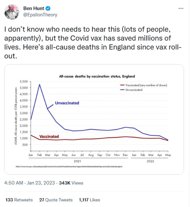
Hell’s Bells. Looks like the ‘vaccine’ worked. I’ve put down my pen and prostrated myself before the altar of Pfizer and am humbly begging forgiveness for my despicable anti-vaxx stance with regard to the Great and Glorious Goo of Deliverance - praise be to Bourla.
But then I had a thunk to myself. All-cause deaths, eh? That’s the title on the chart. If I add the vaxxed and unvaxxed together, then, I should get back to the chart for all-cause death, irrespective of vaccine status. Shouldn’t I?
The red line representing vaxxed deaths is essentially flat - so all-cause deaths irrespective of vaccine status should look like the blue line, just shifted up a bit.
But where have the wiggles gone? This shit is seasonal, don’t you know?
A quick peek at scripture number 2 shows a definite pattern of seasonality
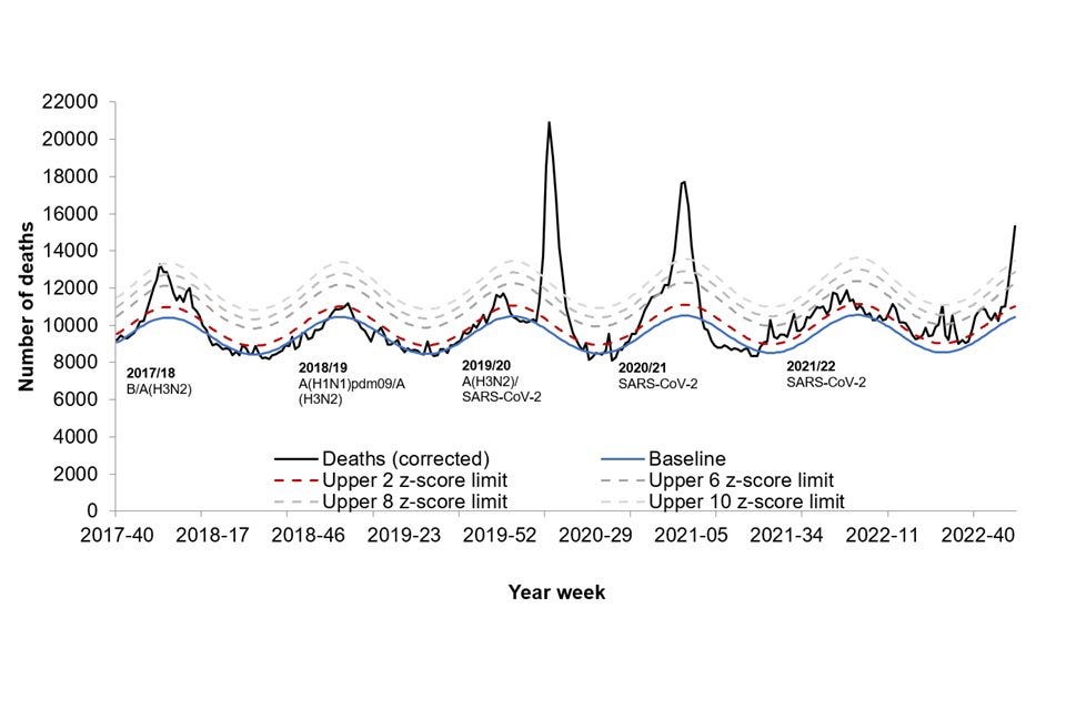
That blue ‘baseline’ there sure looks like it wiggles around a bit as the seasons change.
Rudy, Rudy, Rudy.
Look at the damned axes, you fool!
The y-axis on scripture number 1 is “ASMR, All-cause deaths per 100k person-years”
I beg your pardon? What, pray tell, is the meaning of this verbiage?
It’s true that sometimes we do need to plot stuff that has a quite complicated technical definition. But when it comes to stats claiming any sort of ‘efficacy’ for the vaccine I think we’re entitled to be just a little suspicious that someone is trying to bamboozle us. It sure looks like someone has cast around for some difficult to understand parameter that might look like the vaccine has done its job1.
ASMR stands for Age Standardised Mortality Rate. This is a way of comparing populations against some notional ‘standard’ population. You are basically using a construction like the following : we had this number of deaths (age stratified) in population A. If population A had the same proportions (by age) of our standard population we would have seen this number of deaths. Nothing wrong with doing this - in fact, it’s kind of necessary to be able to make sensible comparisons between different populations.
The real head-scratcher is using person-years per 100k years. I’m not a huge fan of using person-years, in general. It can be useful to get some idea of how something impacts different generations, the idea being that someone who is aged 20 might have another 50 years to live in the normal course of events, whereas someone who is 80 is kind of living on borrowed time with (on average) not much gas left in the tank.
The per here is not something I’ve seen before but it needn't worry us2.
What does this parameter even mean and how is it useful? We’re going to need an example to try to get our heads round this one. We’re going to consider a very hypothetical society. It consists of 20 years olds and 60 year olds (don’t ask how this is achieved - we’re just trying to get a handle on what a technical parameter means here). Let’s further suppose that everyone, in the normal course of things, pegs it at 70.
We’ll imagine that it’s split 75:25 between young/old and consider a total population of 800,000.
Young : 600,000 people, which represents 30 million person-years left to live
Old : 200,000 people, which represents 2 million person-years left to live
So, along comes some virus, let’s call it the BaloneyVirus, and it starts culling people. Let’s suppose the death rate is 10% in the young and 50% in the old. We have, then
Young : 60,000 deaths, 3 million person-years lost3, which is 2,000 deaths per 100k person-years lost
Old : 100,000 deaths, 1 million person-years lost, which is 10,000 deaths per 100k person-years lost
I’m still not much the wiser about what the graph of scripture 1 is telling me. Are you? Maybe we need some algebra here to be able to see what’s going on. What do we have? We have the number of deaths. Let’s call this n. We have person-years lost (in units of 100k years) and let’s call this Y.
But Y is just ny, where little y is the person-years left to live (under normal conditions) for a single individual. So, when you form the ratio n/Y you just end up with 1/y: the number of deaths disappears from the parameter.
At this point, I’m wanting to print out scripture 1 on some nice absorbent and soft paper and do something more useful with it.
But a few more thunks tells us that this disappearance is an artefact of using just a single population here. Let’s suppose we had our hypothetical population split into 3 groups - the 20, 40 and 60. If we wanted to work out the effect of the BaloneyVirus on the 20 and 40 group we’d have n(20) + n(40) on the top of the ratio, and
n(20)y(20) + n(40)y(40)
as the dividing quantity on the bottom of the ratio.
With this ratio, considering 2 sub-populations, the number of deaths doesn’t disappear when forming the ratio.
But we’re still very much within the territory of “WTF does this even mean?” here - if anything, it’s gotten worse.
After an hour or so playing with tedious algebra to try to understand what this POC (parameter of confusion) actually means - I give up. I can tell you it doesn’t depend solely on vaccine efficacy, but on other things like the percentage vaccinated4. The ratio of POC(vaxxed) to POC(unvaxxed) is not an easy thing to get your head round. So any claim that it demonstrates ‘vaccine efficacy’ must be taken with a pinch of salt - especially when the numbers of vaxxed vs unvaxxed are so uncertain.
It’s certainly not any (direct) evidence that “millions” of lives have been saved by the vaccine - to establish that would require a very significant disentanglement of all the various factors that go into making up the POC.
But do we really need the POC? I’ve added some technical notations to scripture 2.
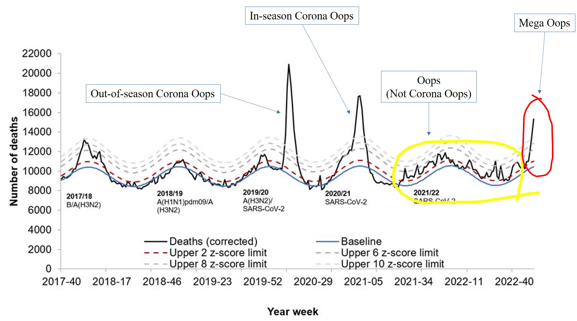
When you ditch the parameter of confusion and just consider numbers of deaths directly, a wholly different picture emerges. Excess death has remained stubbornly high since around mid-2021 and the CoronaDoom does not make up a very significant fraction of these (the highest peak during Winter 2021/2022 was about 3.5 CoronaDoom deaths per million population).
And the mega-oops? That’s most certainly not the CoronaDoom.
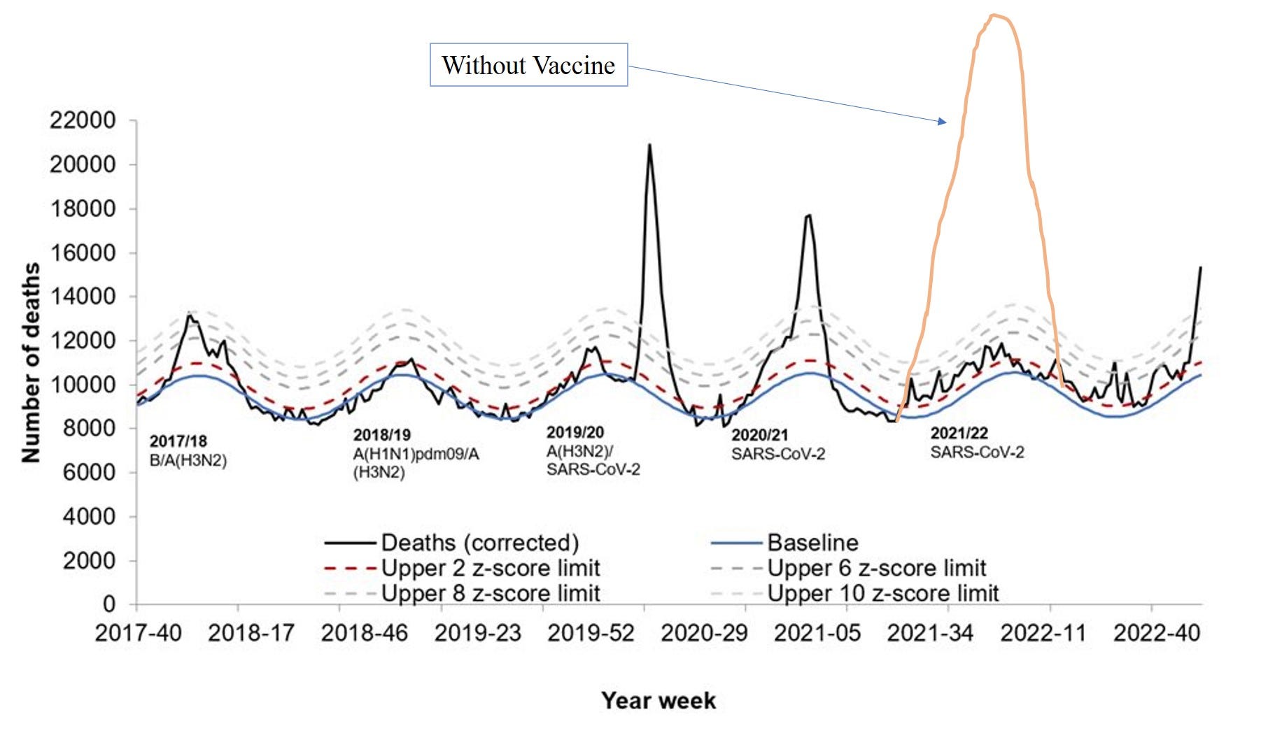
Scripture 1 (or at least the interpretation of it as being evidence that millions of lives have been ‘saved’) is not consistent with scripture 2. I sometimes wonder whether this is the ‘model’ those beholden to the interpretation of scripture use
I used to be fairly religious in my teens to late teens - but I realised that so much depended on interpretation. In terms of Christianity we had preachers making assertive statements about something that had basically gone through the mangling process of Aramaic —> Greek —> English and that even in the final polished English could be interpreted in several different ways.
The same is true of government stats
To be fair to the ONS it might not be them making this claim. I haven’t read the ONS document from which this chart came, so it might be simply one amongst a slew of charts with subsequent reasonable discussion and explanation. I’m not interested in what the ONS says about this, but how the chart, the ‘scripture’, is being used by others.
It’s just a scaling factor that translates things into a more ‘convenient’ measurement unit.
It is not clear whether the per 100k refers to the original ‘weight’ of life in the group, or the lost ‘weight’ of life in the group. Common sense dictates it’s the latter. It’s per 100k and 3 million here is 30 x 100,000, so we need to divide by 30 to get the deaths per 100k person-years lost
What this means is that’s it’s possible to adjust the ratio (vaxxed vs unvaxxed POC) by adjusting the vaxxed percentage, for example - whilst keeping the vaccine efficacy the same. So it’s not at all clear what we’re seeing with the graph of scripture 1.
Well the initial graph works just perfectly. It does what it's been told to do. We were warned about stuff like that when I did basic econ at university, to not cook up graphs that proved themselves true via recursive logic.
(Not that those who went on to become economists seems to have listened...mutter grumble feed'em to the squigs the lot of them.)
It also works wonderfully well from a propagandist's perspective: easy to read, looks authoritative, and cannot be refuted or challenged in an equally brief and obvious form. That's A-levels Propaganda, always construct yours so that the opposition must spend multiples in time and energy to refute it.
(That strategy works well in military matters too if you have manpower to spend as if it's ammo - look at chinese tactics in the Korean War.)
"Do you know how many lives have been saved in Britain last year alone by the ban forbidding Chavs from owning nuclear warheads?"
Digression on propaganda:
In rethorics, logical fallacies are tools to get the audience to do what you want them to - always be clear whether you aim to convert the audience to your position or if you are trying to convince them to act in the way you desire. For a concrete example, look at any debate before an election. 100% convince to go vote for either Greedy or Envious (as Hunt Emerson called the two british parties in his Firkin-comics.) For convert, look at how "climate armageddon" has been implanted in virtually all works of fiction in some way since the 1970s at least.
A phrase from my early years came to mind, "When you can't convince them with the facts, baffle them with bullshit."
Seems to be that TPTB have adopted far too many (formerly) satirical phrases as scripture.
I'm beginning to think that if asteroid 2023 BU swings a bit closer than "modeled" it might be a good thing in the arc of history.