The Failure of Intuition
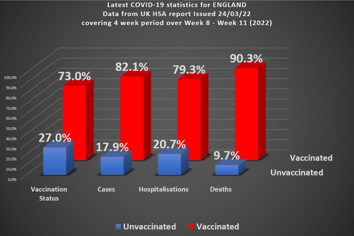
Before my Easter break visiting family I was struggling with trying to understand the data from the UKHSA regarding vaccine performance. The overall stats don’t look very good for the ‘vaccine’ and here they are again :
Roughly speaking (rounding the numbers a bit) you’ve got 70% of the population vaccinated, but 90% of covid death occurring in the vaccinated. You can actually work out the overall vaccine efficacy from this data and it turns out to be around - 285%
People pointed out there are many factors that are hidden when looking at overall data split by just a single variable (vaxx status here) and so the true picture might not look so bleak - or it might even show the vaccines are working!
My intuition railed against such a notion. How could we introduce another variable to turn an overall negative vaccine efficacy into sub-groups with positive vaccine efficacy? My intuition was that this could not be possible.
Turns out I was wrong. It is possible to split this overall group into 2 subgroups A and B such that overall we have a -ve efficacy, but a +ve efficacy in each of the subgroups A and B.
This result still surprises me.
One commonly mentioned extra variable (confounder) is that of age. Older people have different risks than younger people and if we split the overall group into older/younger we would be able to see the effect of this bias more clearly. Of course, we would need to split the age into more than just 2 groups to do it properly, but my thinking was that 2 groups should be sufficient to demonstrate the principle.
I haven’t fully got to the bottom of all this yet - it turns out to be more complicated than I anticipated (more on this later) - but what interests me is the failure of intuition. It may be that I’m just an idiot (high probability), but where have we seen this failure of intuition before?
Lockdowns and masks have a certain intuitive appeal. Our ‘intuition’ screams at us they ought to work. But they don’t. It’s only when we dig a little deeper, and in the case of masks not all that much deeper, do we begin to appreciate why our initial intuitions were all to cock (as we might say in the North of England).
Medical testing is another one of those areas where we see a counter-intuitive result. Most people would naively assume that if a test is 99% accurate and they test positive then it’s 99% likely they have the disease that is being tested for. This is, however, incorrect. I cannot blame them for this because it’s not all that easy to understand.
I’ve used stats in my work - but only fairly simple stats. I’ve never had to deal with the kind of biases that exist in figuring out things like the covid data. This is almost certainly why my intuition failed me when looking at the UKHSA vaccine data.
When teaching courses on things like information theory it is usual to consider communication channels and the binary channel is one of the simplest, and most useful, to get some of the core ideas across. The idea here is that the sender sends a message consisting of 1’s and 0’s - and the receiver receives a message consisting of a bunch of 1’s and 0’s
If there are no errors on the channel the receiver gets the same bunch of 1’s and 0’s (in order) that the sender actually sent. Errors, however, mean that the received message might get a bit garbled. The sender sent a 1, but the receiver received a 0, for example.
In order to get a treatment that works for any possible sent message we have to analyse this statistically and talk about things like the probability a 1 was sent, for example. Errors, then, occur when, for example, the probability a 0 was received given that a 1 was sent is non-zero.
Information theory (for communication channels) is all about characterizing things like this. If we know, for example, that a sender just sends 1 all the time, then no information can be transmitted at all. Claude Shannon, one of my scientific heroes, single-handedly devised the discipline of information theory and revolutionised the world of coding and communication. Shannon’s great insight was that information is related to uncertainty (or surprise). The more you are surprised, the more you have to learn (information) would be a crude way of stating this.
We can use these ideas to understand why medical testing is initially counter-intuitive. Suppose we have a channel where the sender is going to send mostly 0’s, but every now and then sends a 1. This would represent the prevalence of a disease in a medical setting. Suppose that, because of errors, the receiver gets a message with more 1’s than he is expecting (false positives). The receiver knows that these ‘extra’ 1’s are much more likely to have come about because of errors than because the sender actually sent them.
If a sender is sending 1’s with a probability 1 in 100 (so that in any message of 100 bits length there will be, on average, 99 zeroes and only 1 one) and there is an error rate on the channel of 1 in 100, then you can see that if the receiver gets a 1 how does he know whether this has come from a ‘genuine’ 1, or from an error? It’s essentially a coin toss here. Although the error rate is quite low (which translates to a low false positive rate in a medical setting), when you do actually get a 1 it’s a 50:50 toss up whether it’s a real 1 or a ‘fake’ 1 (which would translate into a 50% chance you have the disease when testing positive in a medical setting).
As I’ve had to learn over the last couple of years, there’s much more going on with real world medical and societal data than in a simple binary channel and the possibilities for getting tripped up are, similarly, greater. Note to self : intuitions based on simple ideas often fail when looking at more complex problems.
So, to return to our initial problem, what went wrong?
The idea here is that there is some ‘hidden’ factor we haven’t accounted for by looking at the overall data set, and by not looking more closely we get a misleading picture. In order to account for this we might choose to further separate the data into subgroups. Let’s consider the example of age to see what I’m talking about.
If, as we suppose, age is an important factor, we might want to split the data into 80 and above (group A) and under 80 (group B). We can then look at vaccine effectiveness in each of these subgroups. Of course, for something like age we might want to split things into finer and finer subgroups consisting of age bands 10 years wide, for example. But just splitting things into 2 should give us some indication of what’s going on. If there is an age-dependent factor in there a simple split into just 2 subgroups should give us a pointer.
Now it should be stressed that even if we find some theoretical way of doing a split so that we get +ve efficacy in each (or even just one) subgroup it does not mean that this is what is actually happening in the real world. It just indicates the possibility that something like this might be going on.
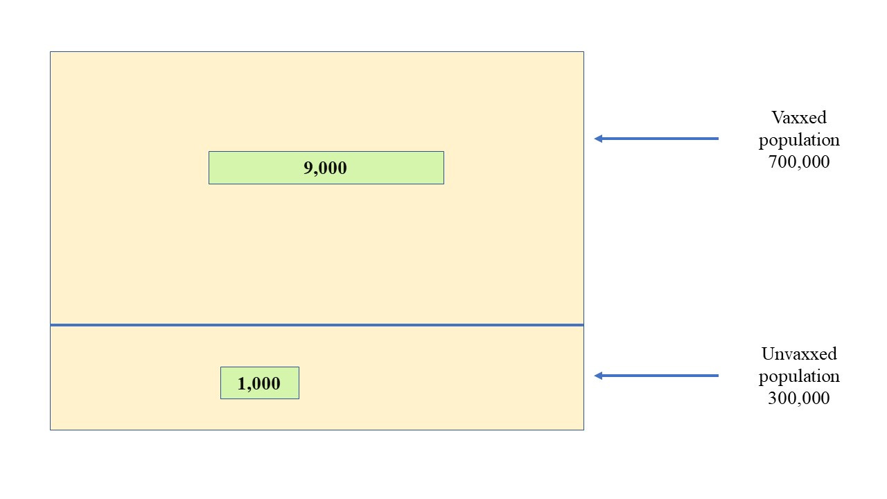
If we take a population size of 1,000,000 with 30% unvaxxed and 10,000 covid deaths (of which 1,000 occur in the unvaccinated) we get an overall picture that looks like this where the green boxes represent deaths
The death figure of 1,000 has been chosen here for simplicity and to broadly reflect the official death stats before the vax - let’s say 150,000 ‘official’ covid deaths in a population of 60 million for England & Wales). It’s in the right ballpark, anyway (at least as far as the ‘official’ figures go).
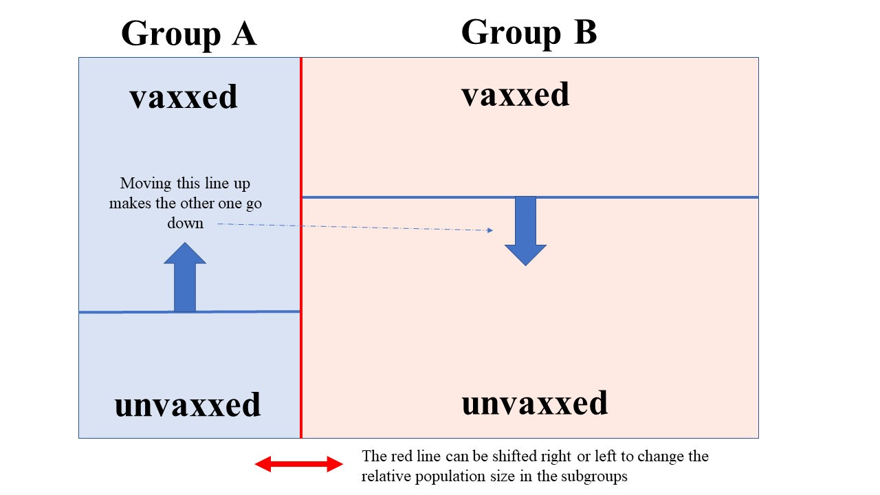
But we’re going to split this into 2 groups, A and B. We need to know the size of these groups. We can introduce a parameter p here so that if p = 0.25, for example, then group A has 1/4 (or 25%) of the total population in it.
Once we’ve done that we can introduce a vaccine fraction (the percentage vaxxed won’t stay the same in each of these new subgroups, in general). So we could have a goo fraction, g, so that if g(A) = 0.4, for example, we would have 40% of the people in group A vaccinated. Note that because we have to maintain an overall 30:70 ratio in the unvaxxed/vaxxed, when we have determined g(A) we know g(B) - and so the goo fractions in each subgroup are not independent of one another.
So the picture we now have (without the deaths included) looks like this
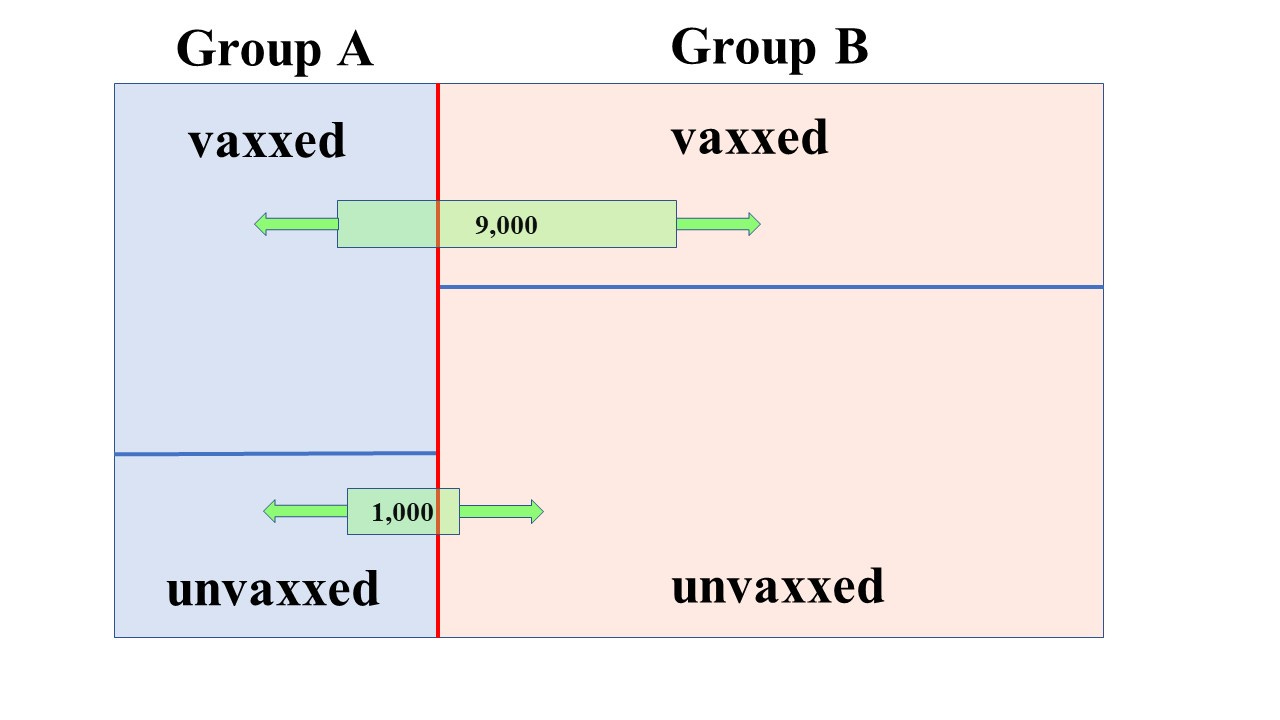
Now let’s add in the deaths
The green boxes (deaths) can be slid back and forth independently (in general - but some care has to be taken. For example, you can’t have 5,000 vax deaths when the vaxxed population in a subgroup is only 4,000).
So you can see there’s 4 things to fiddle with and that’s why it’s not easy (for my brain at least) to develop an easy approach.
One thing is clear though. Let’s suppose we have a picture like the above and we shift the top green box to the left a bit (without changing anything else). This means that we have more vaxxed deaths in the same vaxxed population in group A - in other words, this lowers the vaccine efficacy in group A (higher vaccine death rate). It raises the vaccine efficacy in group B
Similarly we can shift the lower green box to the right (whilst keeping everything else the same) and this means that we have lowered the death rate in the unvaxxed population in group A - which, again, results in a lower vaccine efficacy in group A, and a raised efficacy in group B.
It’s possible, by judicious shifting of these various proportions and boxes, to arrive at two subgroups each having positive efficacy.
Of course, this is all just theoretical diddling about. In the real world we can’t just arbitrarily shift those lines about - the groups represent real people with real stats. So what happens when we try to imagine subgroups with some kind of ‘realistic’ figures attached?
Let’s run with the wrinklies as being a problem group - a bias that skews things. So we might want to look, as suggested before, at the 80’s and over as one group and the under 80’s as another group.
According to the 2019 ONS population estimates for England & Wales there were 3 million people aged 80 and above out of a total population of about 59.4 million. That’s about 5%
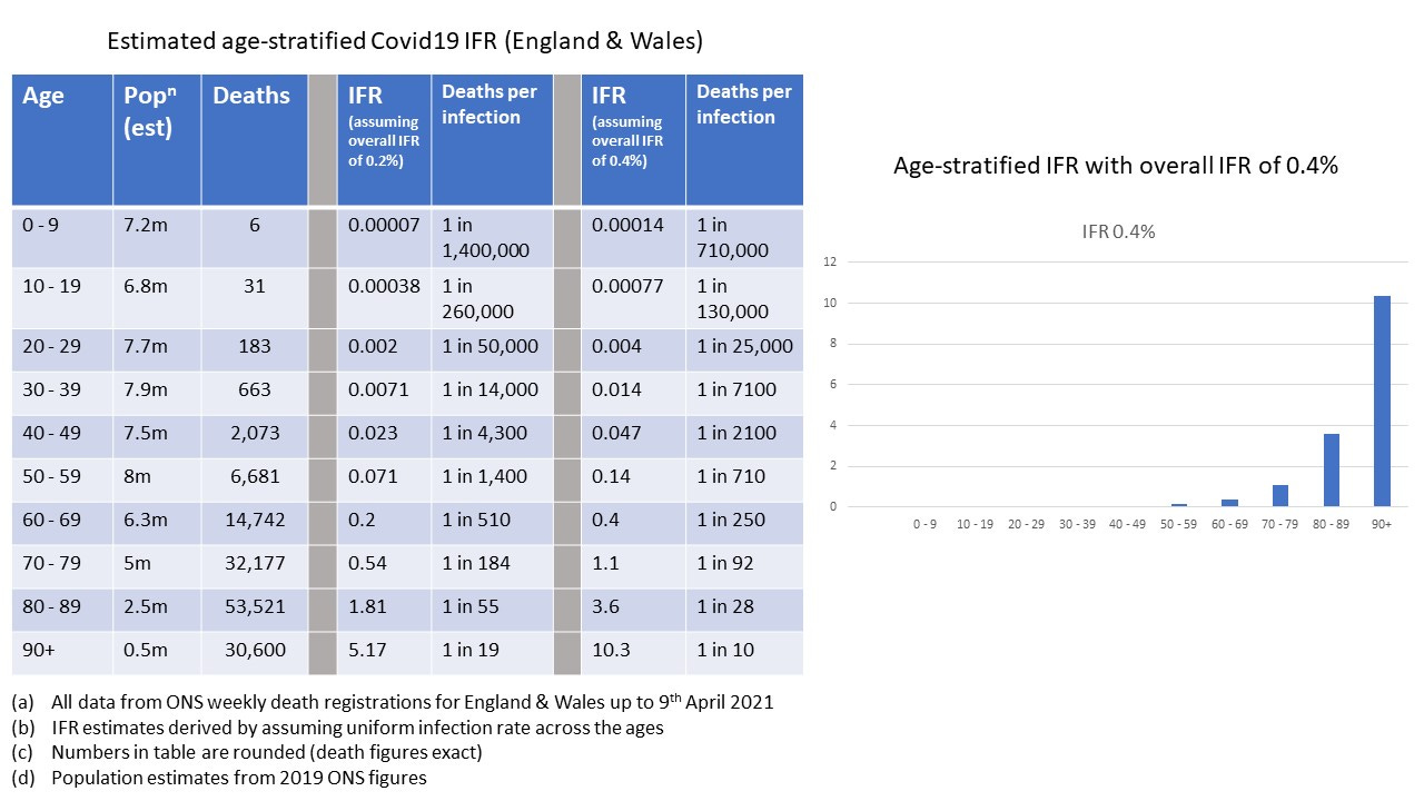
So for our population size of 1 million that translates to about 50,000 people aged 80 and above, and we’ll put them in group A. We’ll run with a figure of 90% of this group having been vaxxed. If you look at the risk table and estimates of IFR (note this does include non-vaxxed and vaxxed periods)
You can see that the risk of death is much higher in the 80 and above age group. Let’s eyeball the figures here and estimate it’s about 500 times higher (remember we’re treating the under 80’s as one big blob so we’ve got a lot of younger folk in there). We could work this out more precisely - but we’re just getting a ‘feel’ for things using semi-realistic numbers (back of the envelope calculation).
We actually want the risk factor to be very different here because our hypothesis is that the elderly, more vulnerable, need separating out because they’re having a disproportionate effect on our overall stats.
With this risk factor applied to unvaxxed deaths it would mean that the rate of unvaxxed death in group A (the 80’s and above) will be 500 times the rate of unvaxxed death in group B (the under 80’s).
So, armed with all these back-of-the-envelope numbers, we can now start fleshing out the relevant figures for our subgroups
Group A (80 and above)
Population : 50,000
Number vaxxed : 45,000 (90% vaxxed)
Number unvaxxed : 5,000
Unvaxxed deaths : 894
Vaxxed deaths : ??
Group B (under 80)
Population : 950,000
Number vaxxed : 655,000 (about 68.9% vaxxed)
Number unvaxxed : 295,000
Unvaxxed deaths : 106
Vaxxed deaths : ??
This is about the right ratio of unvaxxed deaths, but what do we do about the vaxxed deaths? This depends on some level of assumed vaccine efficacy. We’ve been told that the vax is effective at protecting the vulnerable, so let’s say it turns out we have a 70% vaccine efficacy in the vulnerable group A.
With 2,415 vaxxed deaths in group A (out of a total of 9,000 vaxxed deaths overall in the 2 groups) we get pretty close to 70% efficacy (it’s 69.9851%) for this group. Great stuff.
BUT . . .
In group B we have an efficacy of minus 2600%
Now my intuition is (obviously) failing me somewhat these days - but bugger me backwards with a barge pole, there’s just something not adding up at all with these figures.
Our assumptions are clearly wrong. 90% of the over 80’s vaxxed seems a decent proportion, but maybe it’s closer to 95%
Let’s run it again.
Group A (80 and above)
Population : 50,000
Number vaxxed : 47,500 (95% vaxxed)
Number unvaxxed : 2,500
Unvaxxed deaths : 808
Vaxxed deaths : ??
Group B (under 80)
Population : 950,000
Number vaxxed : 652,500 (about 68.7% vaxxed)
Number unvaxxed : 297,500
Unvaxxed deaths : 192
Vaxxed deaths : ??
To get a vaccine efficacy of 70% in group A we’d have to have close to 4,600 vaxxed deaths in this group.
For group B this would give us a vaccine efficacy of minus 900%
It’s not quite as holy a cow as before, but it gives to charity and does good deeds on every other day.
For the last example let’s reduce the assumed efficacy to just 50% for group A and see what happens. We’ll stick with 95% vax rate in group A because it seems to improve things for group B.
Group A (80 and above)
Population : 50,000
Number vaxxed : 47,500 (95% vaxxed)
Number unvaxxed : 2,500
Unvaxxed deaths : 808
Vaxxed deaths : ??
Group B (under 80)
Population : 950,000
Number vaxxed : 652,500 (about 68.7% vaxxed)
Number unvaxxed : 297,500
Unvaxxed deaths : 192
Vaxxed deaths : ??
Now we only need the efficacy to reach 50% in group A and if we had 7,680 vaxxed deaths in this group this would give us close to 50% efficacy (49.97%)
But in group B we would have a minus 210% efficacy.
With 95% of group A vaxxed and a 500 fold increase in risk in this group we can have around 40% positive vaccine efficacy in both groups - but this requires there to be only about 250 vaxxed deaths in group B. That’s 250 vaxxed people dying of covid out of 652,500 people vaccinated in the under 80’s.
Strangely enough, this makes some kind of sense because with these numbers you have the death rate in the vaxxed over 80’s being about 500 times the death rate in the vaxxed under 80’s which is similar to the risk gradation we get from the official stats. I don’t know what the age breakdown of the death stats actually is.
But, anyway, around a 40% efficacy is pretty shite (and this is all before we consider side effects and important things like the number needed to vaccinate, or NNTV). Importantly, this also assumes the death classifications are correct - but as we know, all sorts of statistical fiddling went on where recently-vaccinated people who died of covid were classified as an ‘unvaccinated’ death.
In summary then
Intuition, particularly mine, can be crap
when (semi) realistic figures are used in a simplified age breakdown of the stats into two groups it’s nigh on impossible to get a good picture for the vax in both groups. The most plausible assumption where risk prior to vaccination scales relatively across the age groups in the same way post-vaccination gives us only around 40% vaccine efficacy in both groups (and that’s before we consider the other major sources of error we know about - like misclassification of deaths)


"It’s not quite as holy a cow as before, but it gives to charity and does good deeds on every other day." :)
And it always wears a mask to protect the vulnerable.
I like the sliding-boxes visualisation. When is the interactive tool coming out?
I think your example of the 1/100 error rate in a communication channel describes what is known as "positive predictive value" in the medical world, at least as I understand it from watching this video:
https://www.youtube.com/watch?v=NSRK41UbTEU&t=140s
I had to work through the examples in the video several times on my own before I could understand it well enough to write a small program to calculate the positive predictive value of a PCR test, given its sensitivity, specificity, and the seroprevalence. When I try to explain this to people without diagrams and math, I use a greatly simplified example: if a test has a 5% false positive rate, but only 5% of people actually have the disease, when you get a positive test, it could just as likely be real as fake.