
Homer's Challenge


My last couple of posts have been focussed on looking at the recent UKHSA data which doesn’t look too great on the surface of things.
It suggests that 70% of the English population has been vaccinated, but that 90% of covid deaths are occurring in the vaccinated.
Witzbold made a very pertinent comment in a reply to my last post. Could I be ignoring biases and weightings which might invoke a Simpson’s paradox which would render my arguments wrong?
I’m worried about this too, and I don’t think I have the matter properly squared away.
The idea is that when we look at overall data it can give a misleading picture. I’ll attach an example of a Simpson’s paradox at the end. So for covid, for example, when we have everyone lumped together we’re ignoring things like different age factors, or risk factors, and so although the overall picture might look bad it looks much better when we focus in on these various differences.
That’s the suggestion anyway.
Let’s just focus on age as an example. Let’s suppose that, for some reason, it is the under 30 age group that is skewing things. So let’s split the data into under 30 and 30 and above and now look at how things stand for these different groups. So we’ve removed the ‘problematic’ cohort with the idea that things will now look much better than before (in terms of vaccine effectiveness) in the over 30 group. Is there a way to do this?
So the challenge is this :
We have 1,000,000 people
700,000 of them have had the vaccine
300,000 of them have not
9,000 of those who have taken the vaccine have died of covid
1,000 of the unvaccinated have died of covid
Can we split these into 2 groups, A and B, so that the vaccine looks better than this in both groups? Can we split these into 2 groups, A and B, so that the group with a bigger population has a good vaccine effectiveness?
I had a bit of a play last night and I couldn’t come up with a combination that looked good for the Goo, but I might be missing something (highly probable).
Here’s the issue in a diagram
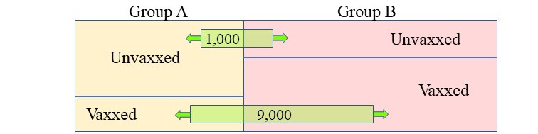
Things we can do
slide the green boxes back and forth
change the relative sizes of A and B
change the proportion of vaxxed and unvaxxed in each group
BUT
we must do these things in such a way that
overall we still have 30% unvaxxed and 70% vaxxed
overall we still have total population of 1,000,000
overall we still have 90% of the deaths occurring in the vaxxed
Here is one attempt of mine:
Group A
100 vaxx deaths
500 unvaxxed deaths
100,000 total population
50,000 unvaxxed
Group B
8,900 vaxx deaths
500 unvaxxed deaths
900,000 total population
250,000 unvaxxed
If I did the sums right then the vaccine efficacy in group A is 80% but the vaccine efficacy in group B is about - 580%
So it looks not too bad for group A, but disastrous for group B. But there’s only 10% of the population in group A, so 90% of people are in the Titanic heading for Goo iceberg.
The overall vaccine efficacy is - 285% (again if I’ve done my sums right)
I don’t think there’s any way to ‘remove’ a problematic confounder so that we have a good result for the vax for a significant majority - but you guys might be able to find a way to do that.
And also note that we only need to do a binary split - if we can’t do it for that we won’t be able to do it for any more complex split.
Homer’s Appendix
Simpson’s Paradox is one of those seemingly counter-intuitive and curious things that occur in probability and statistics. It only seems to be a paradox if you ignore the effects of weighting.
There’s a great example I use to illustrate this from the world of gender pay gaps - although I have to hark back to more traditional times because these days I haven’t the faintest idea what a man or a woman is supposed to be.
Let’s imagine a hypothetical company; Patriarchy Inc., or PI for short. This company employs both men (50% of total workforce) and women (50% of total workforce) in either managerial roles, or office roles. Despite its name, PI pays women $55k for management roles and $25k for office roles. For men it only pays $50k for management roles and $20k for office roles So, for each role, women are paid more than men.
Great - the DIE (Diversity, Inclusion & Equity) people should be happy.
But along comes Jemima Greenhairdo (pronouns ding/dong) who notices that only 25% of the women are employed in a management role, whereas it’s 75% for men. If you now work out the average pay for women, and the average pay for men, across all roles you get the following
Average pay for men : $42.5k
Average pay for women : $32.5k
So for the company as a whole, women, on average, are paid less than men - despite being paid more for each individual role.
"Lies, damned lies, and statistics."
I understand the potential problem(s) that arise when dealing with statistics, confounders, and Simpson's Paradox. However, when it comes to the so-called WuhanFlu vaccine even Little Lord Foulci [sic] admits being injected with the Goo doesn't prevent viral infection or transmission. So unless your fool enough to accept the newly refined definition of vaccine the Goo it is not a vaccine.
So the real issue is not whether Harry or Sally is paid more statistically or in real dollars, pounds, or rubles. The issue is whether or not it matters when the currency is counterfeit?
Jemima Greenhairdo is frothing at the mouth and daring you to bring up arrest and incarceration statistics.
As for mortality from Covid, it would be really pathetic if a product not only increased all-cause mortality (as these vaccines appear to) but couldn't even reduce deaths from the virus they (don't) claim to prevent. No wonder they have to stop publishing this data.